


 Napkin AI Review


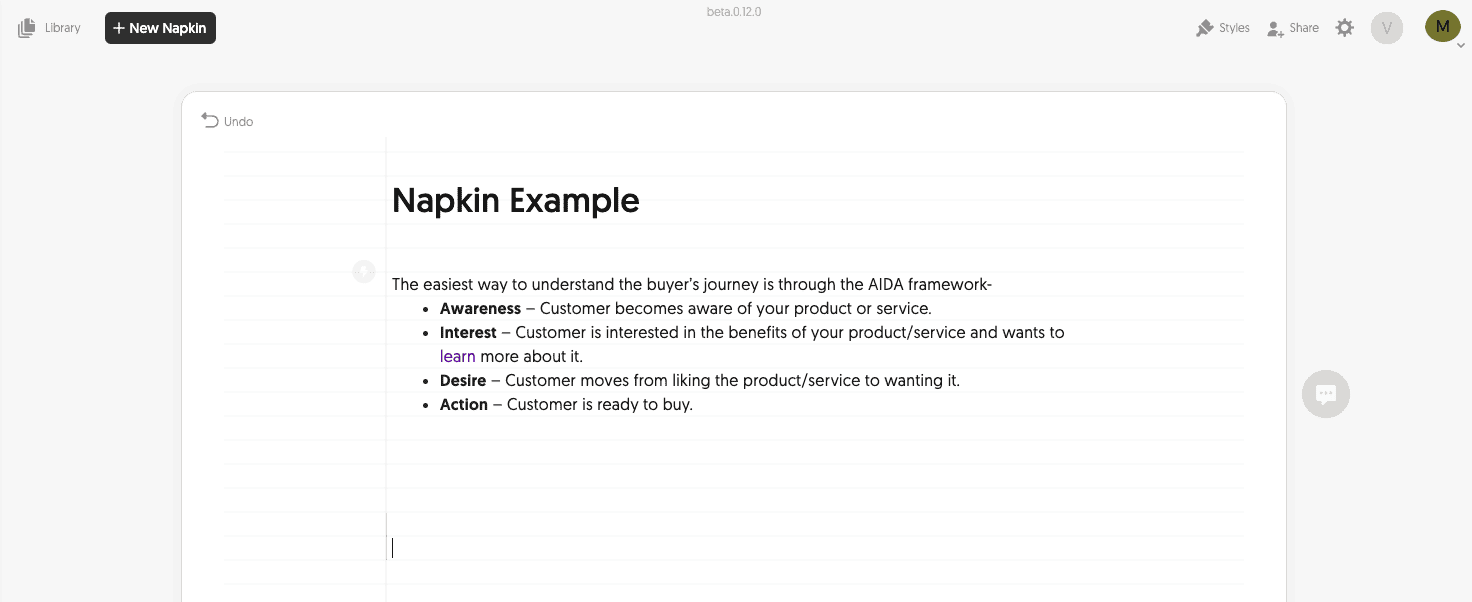
Think about this:
Our brains process visuals 60,000 times faster than written text!
What’s more?
Posts with eye-catching images get up to 650% more engagement.
But creating great visuals for your website, blog content, and social media posts is time-consuming.
And if you don’t have design skills, it’s a frustrating process.
Napkin AI is completely changing how we create visual graphics.
I’ve been using this tool for the past few months, creating graphics for my own website.
The results have been huge…
It replaced the graphic design company we used before, lowering our design costs by 94% and reducing turnaround time to almost zero.
Sounds too good to be true?
In this Napkin AI review, I will show how this game-changing tool will save you time and money while still making your content stand out.

What Will I Learn?
What Is Napkin AI?
Napkin AI is an AI-powered design tool that turns text into high-quality visuals in a single click.
Napkin AI was founded by former Google employees Pramod Sharma and Jerome Scholler.
It was launched in 2023 after raising $10 million in funding from Accel and CRV.
What makes it special?
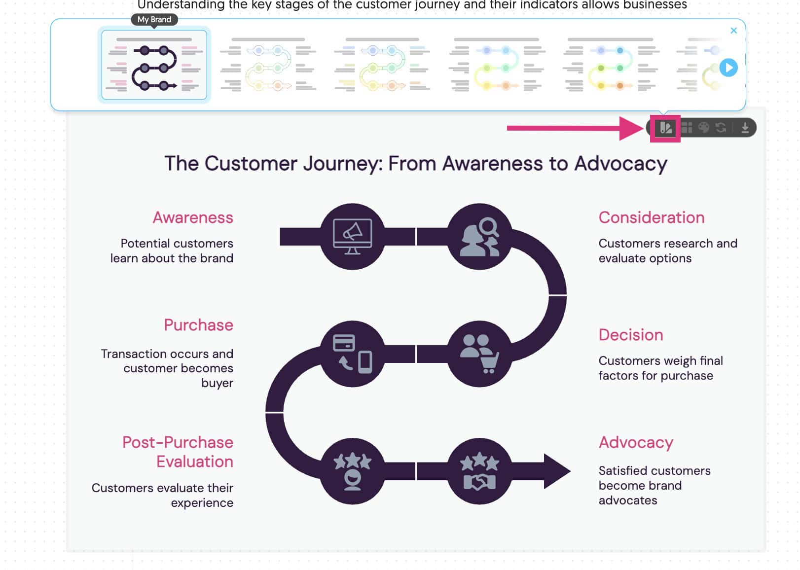
You simply paste in your text, and Napkin AI generates relevant visuals in seconds. All you have to do is pick the one you like the most, make any additional edits, and you’re done.
The name Napkin comes from the concept of sketching ideas on the back of a Napkin – quick, simple and effective.
And the truth is that the tool lives up to its name!

Napkin AI Pros & Cons
These are some of the pros and cons I found when testing Napkin AI:
| PROS | CONS |
|---|---|
| ✅ Generate clean visuals in seconds | ❌ No native integrations or API |
| ✅ Easy-to-use interface | ❌ Limited design flexibility |
| ✅ AI understands complex text | ❌ Templates can start to feel repetitive |
| ✅ One-click brand customisation | ❌ Credit system isn’t straightforward |
| ✅ Real-time collaboration and sharing | ❌ Works well in English only |
| ✅ Affordable pricing | ❌ Cloud-based platform requires an internet connection |
| ✅ Free forever plan available | |
| ✅ Export in 4 different file types |
📋 Napkin AI Pros: What I Think You’ll Like
- Create Visuals In Minutes – Napkin AI takes text and generates visuals in 3-8 seconds. On average, I found it took me about 3 minutes to generate a complete design from start to finish. That includes minor adjustments like text editing and colour changes. There isn’t another tool that can deliver the same quality at that kind of speed!
- Easy Learning Curve – There is almost zero learning curve when using Napkin AI. That’s because they have a fully integrated design process that makes it easy to generate visuals quickly. After signing up, you can have a fully generated and edited graphic in minutes.
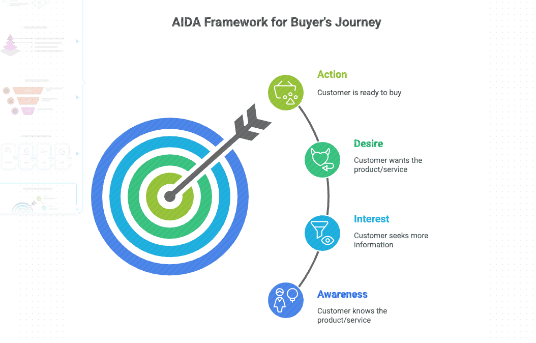
- Smart AI That Understands Context – The AI understands hierarchy and relationships within your text. It knows which elements belong together and how to display them accurately. That means you can generate more complex designs for processes and workflows.
- Customise Your Brand – It’s easy to add your brand colours and fonts to Napkin AI. Then, applying them to your generated visual is as simple as one click. This feature makes generating on-brand graphics an absolute breeze.
- Real-Time Collaboration – Napkin AI has excellent collaboration features built in. Share the Napkin link with your team and set their access level. They can then make comments, changes, and even download the visual directly from the link.
- Budget-Friendly Pricing – Napkin AI offers a limited free forever plan, and the paid plans start at just $12 per month per person. I’ve saved around 94% since using Napkin AI compared to outsourcing to a graphic design agency.
📋 Napkin AI Cons: What I Think You’ll Dislike
- No Native Integrations (yet): Napkin AI does not offer native integrations or API access. There is an opportunity to create integrations with messaging tools like Slack or other design tools like Figma.
- Template Library Can Be Repetitive – After generating enough visuals, you will start to realise that Napkin uses the same templates again and again. Personally, I don’t mind this because it keeps everything on brand. But it could be limiting for some users.
- Limited Design Flexibility – Napkin AI is all about speed. That means the post-generation design tools and options are limited. If you want more sophisticated customisation, Napkin AI will have less flexibility.
- Credit System Isn’t Straightforward – 1 credit = 1 AI action. But it isn’t easy to understand how many credits you use when generating visuals. In my testing, generating one visual costs around 30-50 AI credits, meaning you can generate around 10-16 visuals per month on the free plan.
- Only English Works Well – The AI is trained in English, and it’s noticeable. While you can use other languages, the outputs are less accurate. If you’re using a different language to generate visuals, it’s worth testing the platform before committing to a paid plan.

What Makes Napkin AI Different?
There are tons of graphic design and image visualisation tools on the market.
But Napkin AI brings some practical and unique features that other tools don’t have.
AI-Powered Text-To-Visual
This is Napkin AI’s flagship feature…
Paste in your text and click the spark button. Within seconds, the AI analyses your text and generates multiple visual graphics to choose.
It really does feel like magic!
I tested it with everything from bullet points to more complex descriptions.
Napkin AI consistently understood the text and created relevant, logical visuals that perfectly represented the idea.
This isn’t just about creating pretty pictures.
Napkin AI understand the relationships between:
- Statistics
- Concepts
- Hierarchy of information
That means the quality of the generated graphics is visually impressive and adds value to your content!
Quality Customisation Options
After generating your visual, Napkin AI gives you some simple tools to polish the design.
You can customise-
- Icons
- Decorators
- Connectors
- Colours
- Fonts
The customisation features are well thought out.
AI does 95% of the work – you can come through at the end to fine-tune everything.
It’s a great workflow that means you get high-quality designs every time.
Collaboration Features
If you work with a team, collaboration features are essential.
Napkin AI has a bunch of collaboration tools that make working together seamless. You can easily invite other team members to:
- View
- Comment
- Edit
- Edit and Share
The commenting system lets team members leave notes directly on a specific element. They add their comment and publish.
This leaves no ambiguity in the comments and ensures that feedback is crystal clear.
All changes sync in real time, which reduces turnaround time and allows you to collaborate much more efficiently.
Speed & Simplicity
The main goal of any AI tool is to help you accomplish more – faster.
And that’s exactly what Napki AI does.
But their real strength is that they’ve also delivered powerful features in a clean and intuitive interface. There are no complicated menus or tools to figure out.
Everything is where you expect it to be.
Napkin AI has an almost zero learning curve.
I signed up, logged in, and generated my first graphic in less than five minutes! ⏰
The best part was that getting my team on board and using Napkin AI was also easy.

How To Start Using Napkin AI
Ready to try Napkin AI for yourself?
They have a completely free plan that you can use to test drive all the features.
Here’s how to get started:
✅ Step #1: Sign Up For A Free Account
1. Head over to the Napkin AI website and click “Get Napkin Free”.
2. Click “Sign In with email”, then select “Sign Up”.
3. Get the verification code from your email and add it in.
There is a short onboarding form that you will need to fill out.
It doesn’t look like Napkin AI uses the onboarding information to personalise your account. It is for internal use only.
Once you complete the form, you’ll be all signed up with a free account and ready to create your first “Napkin.”
✅ Step #2: Create Your First Napkin
1. Click on the “Create my first napkin” button.
Napkin allows you to generate the text by AI and then have the AI visual creator create the visual.
But to start with, I recommend using your own text from something you’re already working on.
2. Click the “By pasting my own text” button.
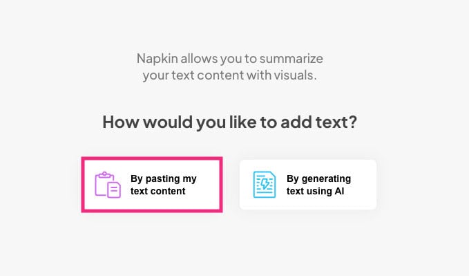
Now, you are ready to generate your first Napkin!
✅ Step #3: Generate Your First Visual
1. Copy and paste some text into the provided area.
You’ll be immediately taken to the main Napkin editor.
I’m using some text from my buyer keywords blog posts in this example.
2. Highlight your text and select the blue spark generate visuals icon on the left.
![]()
It takes a few seconds to generate the graphic.
3. On the left, you should have about 10+ different styles of graphics to choose from. You can click “more” to get even more visual options.
Don’t worry too much about the colours at the moment – you can customise them later. For now, focus on the graphic itself.
Not happy with any of them?
At the bottom of the styles menu, there is an option to customise results:
- Visual type – Explain the kind of visual you were after (e.g. mindmap)
- Detail level – Summary, auto or detailed.
- Closer to text – Check the box to generate a graphic closer to your text.
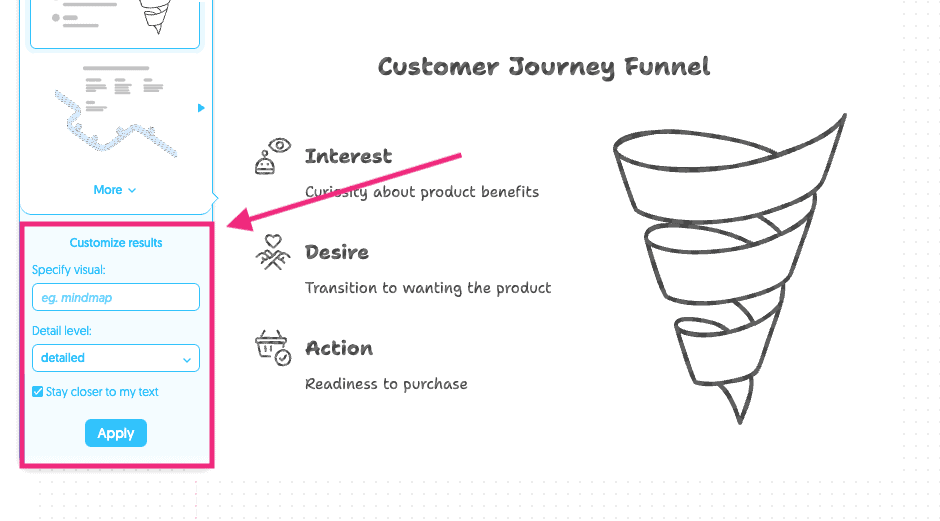
These customisation settings can produce some really interesting and detailed graphics. More on that later.
For now, choose a style you’re happy with.
That’s it! You’ve successfully created your first visual with Nakin AI.
How To Use Napkin AI
Now that you’ve signed up for an account and understood the tool, I will walk you through the Napki AI platform.
There are some hidden settings that will help improve the results you generate.
Understanding The Homepage
When you log in to Napkin, you will automatically be redirected to the last Napkin you were working on.
On the left, you have your library, where you can see:
- All of your Napkins
- Your recent Napkins
- Quick access to create a new Napkin
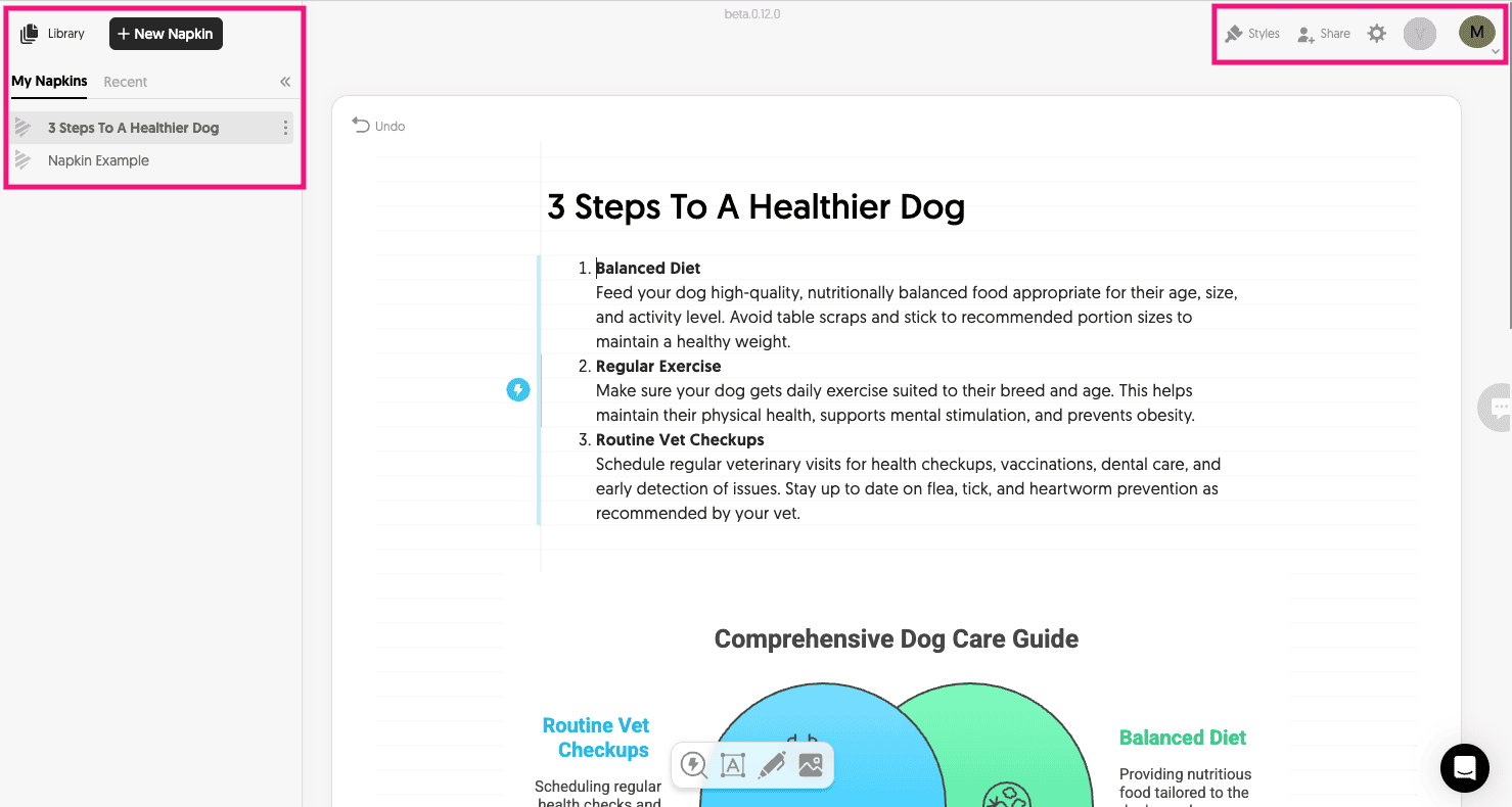
In the top right, you access your account settings and share the current Napkin you’re working on.
The user interface is clean and minimalistic. It is easy to navigate without feeling overwhelmed.
I also like that it loads your last Napkin automatically. It’s easy to log in and pick up where you left off.
Creating Visuals From Text
I’ve already shown you how to create your first Napkin visual.
So, in this section, we will dive a little deeper.
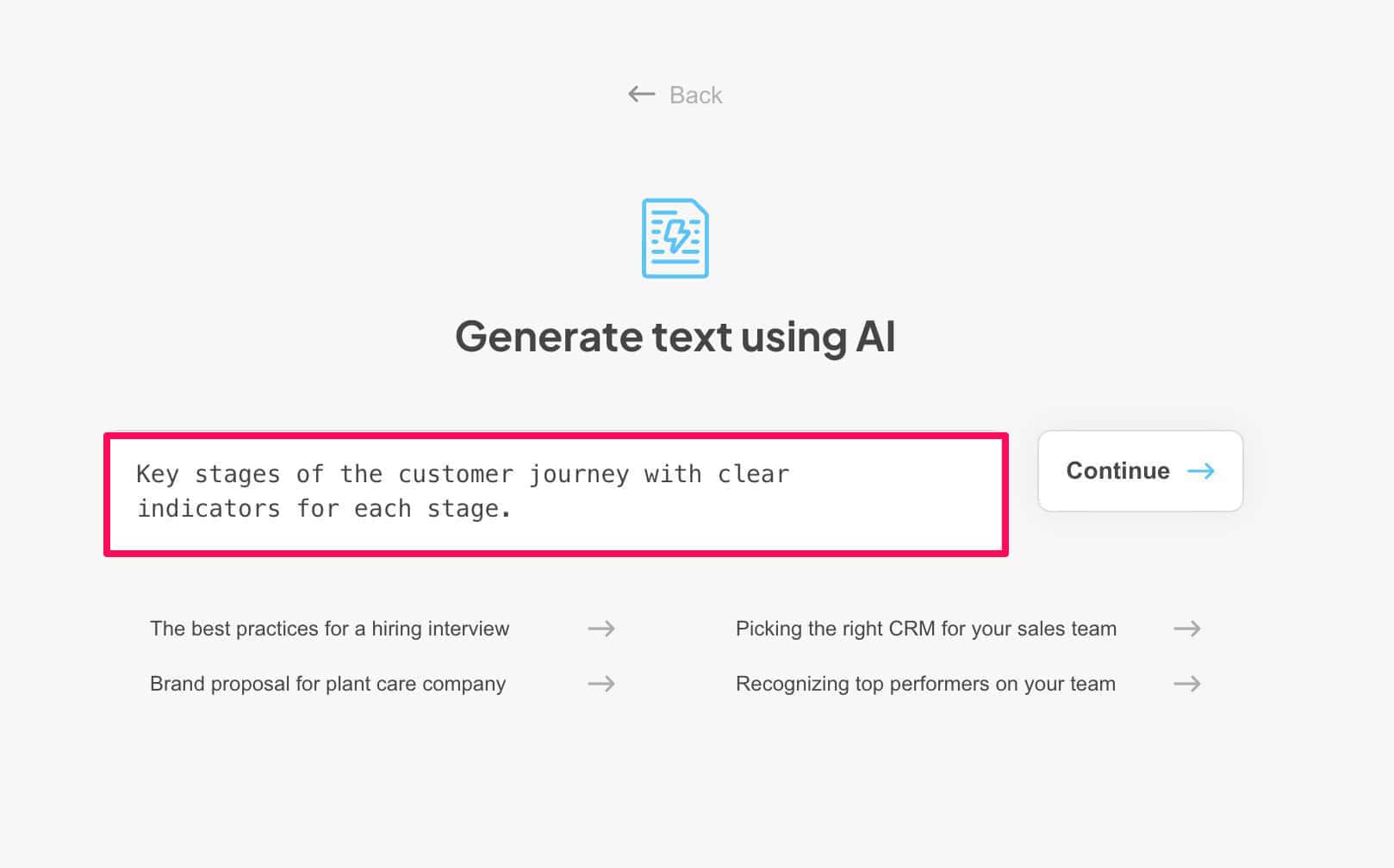
1. Click on “New Napkin” and select “Draft with AI”.
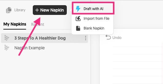
2. Now, add in your text prompt.
The key to a great prompt is to be very specific. The clearer you are with the prompt, the better the output will be.
3 Click “Continue”.
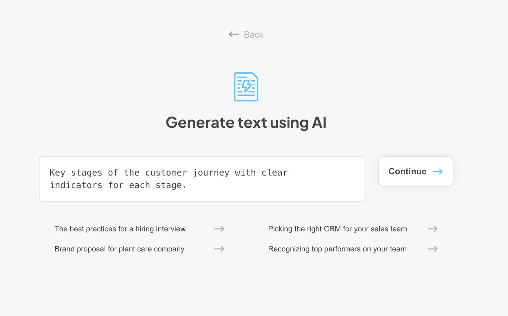
The AI generator will write the text based on your prompt.
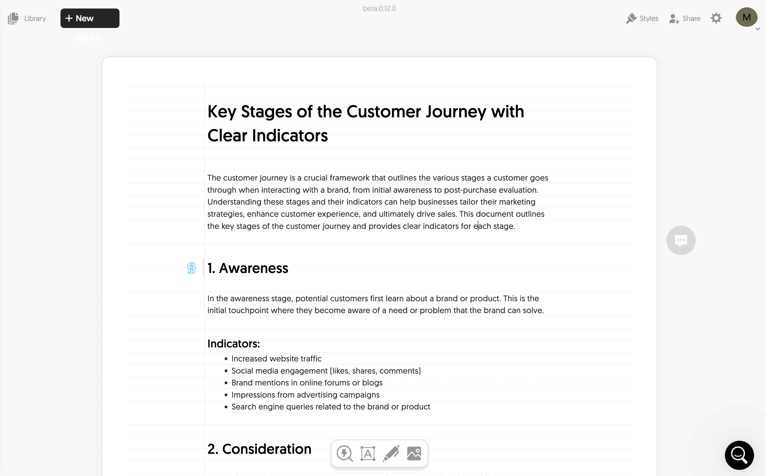
It tends to write a lot of text and be descriptive. This is great because it typically means you get a better output when generating the visual.
Feel free to make any edits or changes to the text.
4. Then, select all of the text (CTRL + A) and click the “blue spark” icon to generate a visual.
![]()
5. Look through all the styles and select the one you like the best.
That’s it!
The AI prompt is a nice value-added feature for creating graphics. It allows you to generate visuals almost from scratch without needing to write anything.
Pro tips for better visuals:
- Use clear and structured content (headings, bullet points, number lists)
- Add content that clearly describes processes, relationships or comparisons
- Add data or numbers that are clearly articulated
- Maximum 60 to 300 words of content per visualisation
Customisation Options
Napkin AI’s customisation options are simple but solid.
Let me show you how they work:
1. Click on the graphic you generated to bring up all the customisation options.
You can select almost any element on the page.
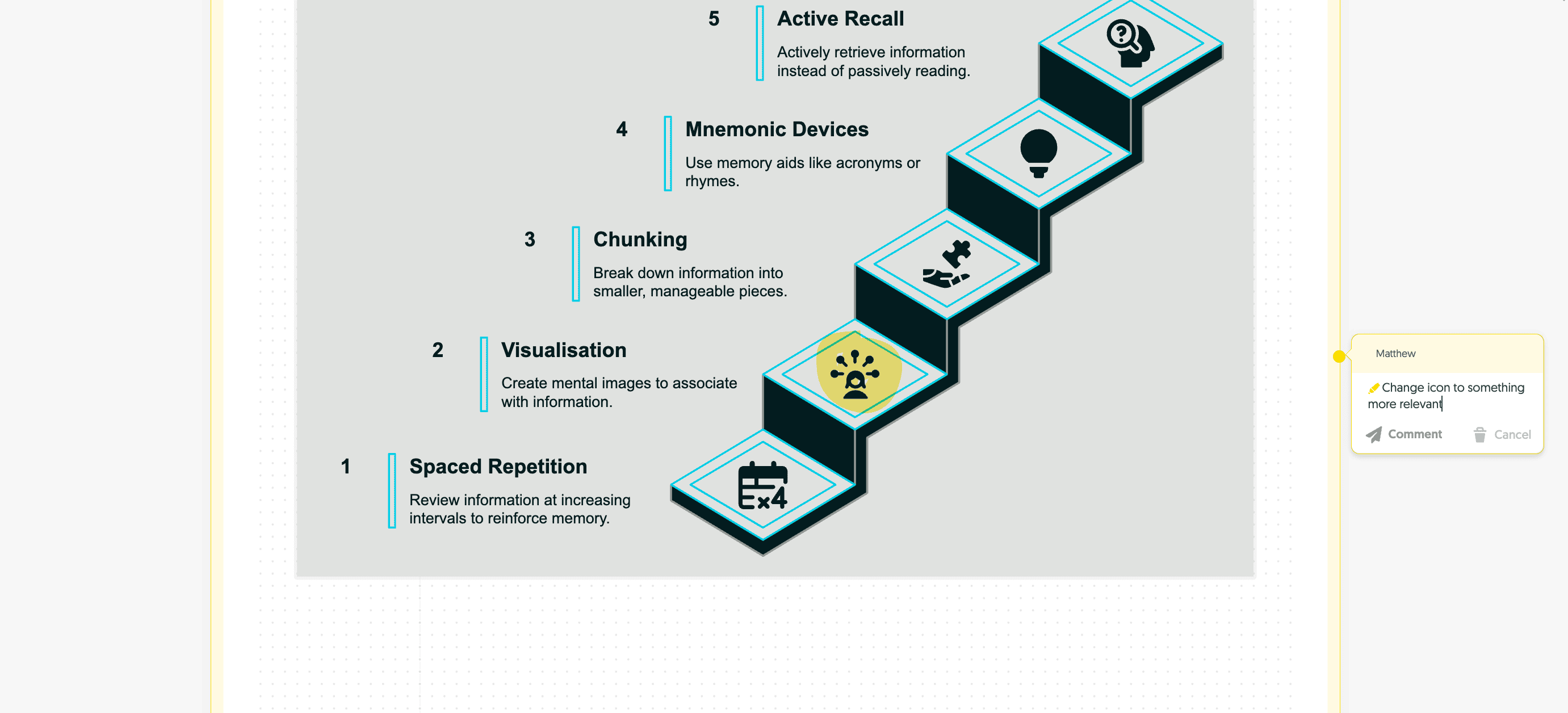
Here’s what you can customise:
- Elements & Layout – Customise elements and change their styling and colours.
- Text editing – Double-click any text element to edit the text.
- Colour schemes – Apply your brand colours or change the colour of any element.
- Icons & graphs – Replace any icon you want with Napkin’s extensive library.
- Connectors & relationships – Modify how elements connect with lines and arrows.
- Background options – Change between transparent, solid or gradient backgrounds.
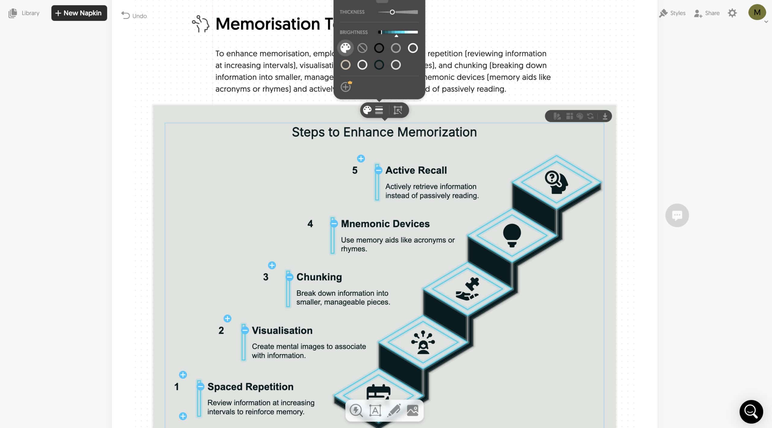
I changed the first icon by clicking the element, mousing over the blue spark, and searching in the pop-up.
![]()
Be specific when searching for icons. You don’t just have to use one-word searches.
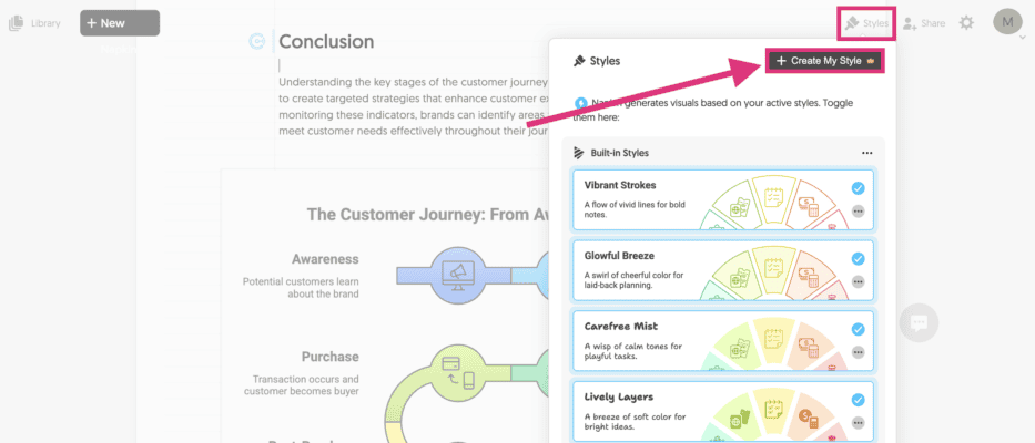
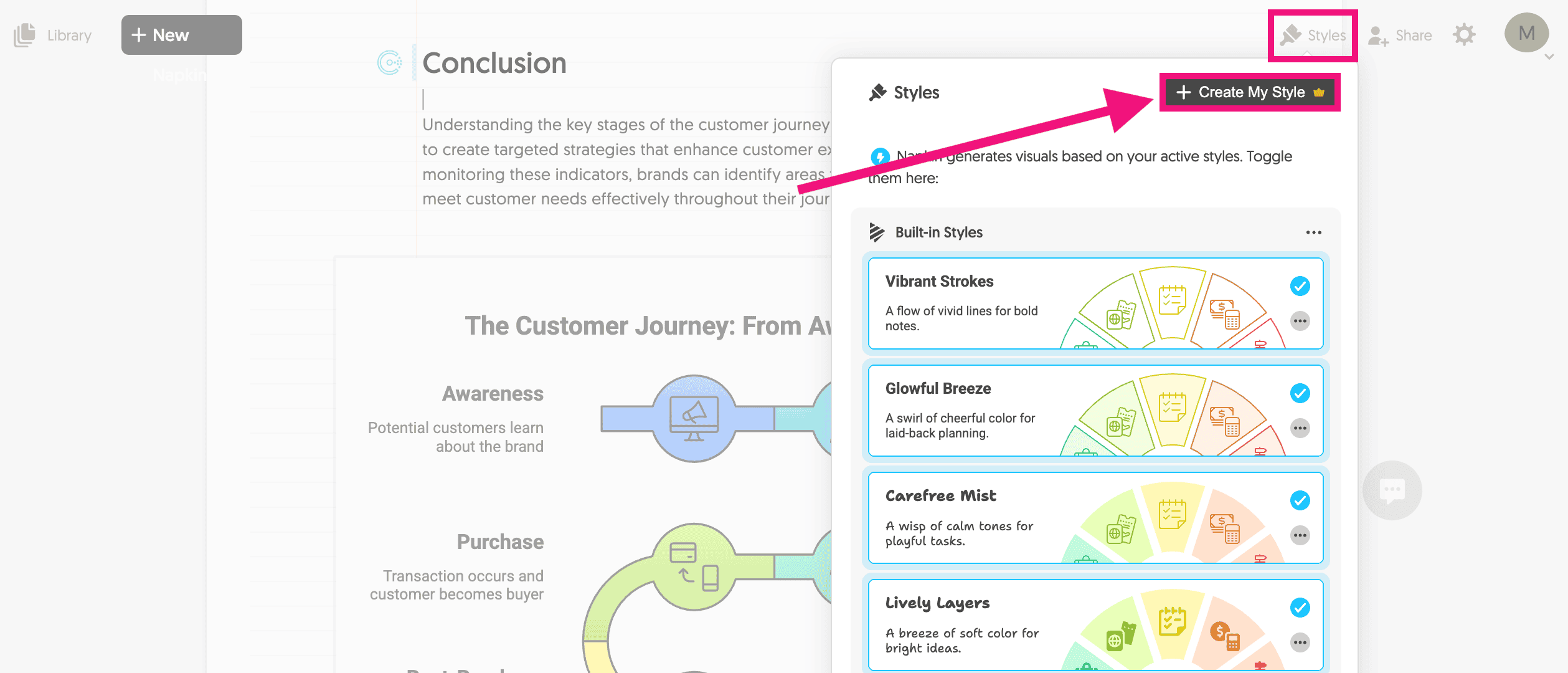
2. Next, I wanted to adjust the colours to match my brand. The easiest way to do that is to create a brand style.
Click on styles in the top right of the page, and select “Create My Style”.
You can manually add your brand colours.
But to speed up this process, I recommend taking a screenshot of your website and uploading it into Napkin AI.
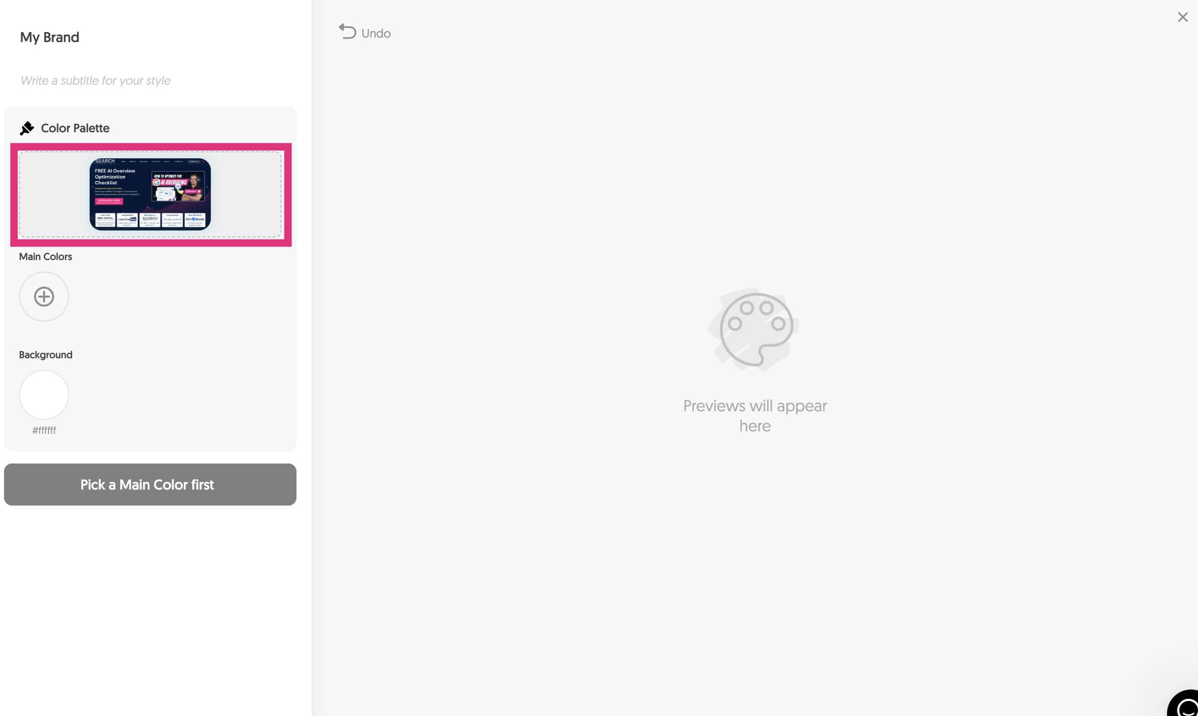
Napkin AI analyses the image and automatically pulls in your brand colours.

Cool, right?
I did this a few times and found that it doesn’t always work perfectly.
So, double-check before moving on.
3. Now, click on the “Pick Fonts” button and select your brand font.
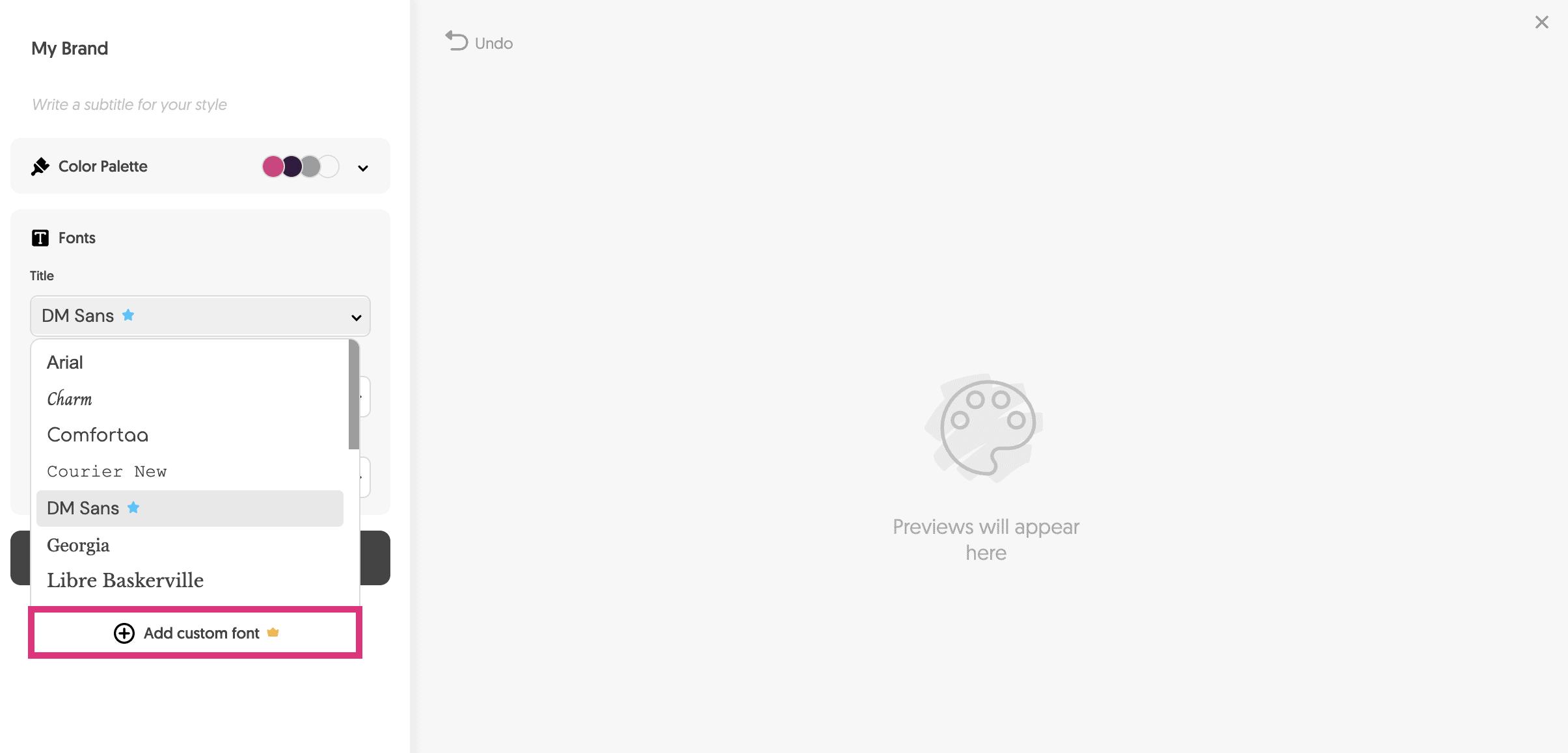
Napkin AI comes loaded with only a few fonts. But you can add custom fonts that you’ve designed or add them from Google Fonts.
4. With the font selected, click “Generate Styles”.
The AI will create a range of styles based on your brand colours.
5. Select the best one and click “Fine Tune Your Style”.
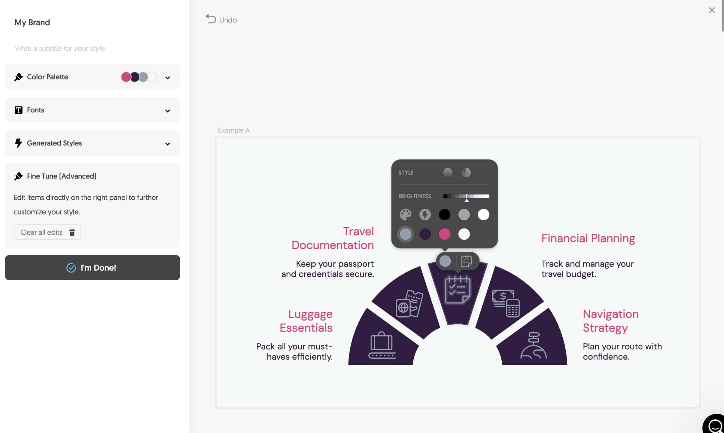
Here, you can make final adjustments to your style.
6. When you’re done, click “I’m Done.”
Your style will be saved under styles.
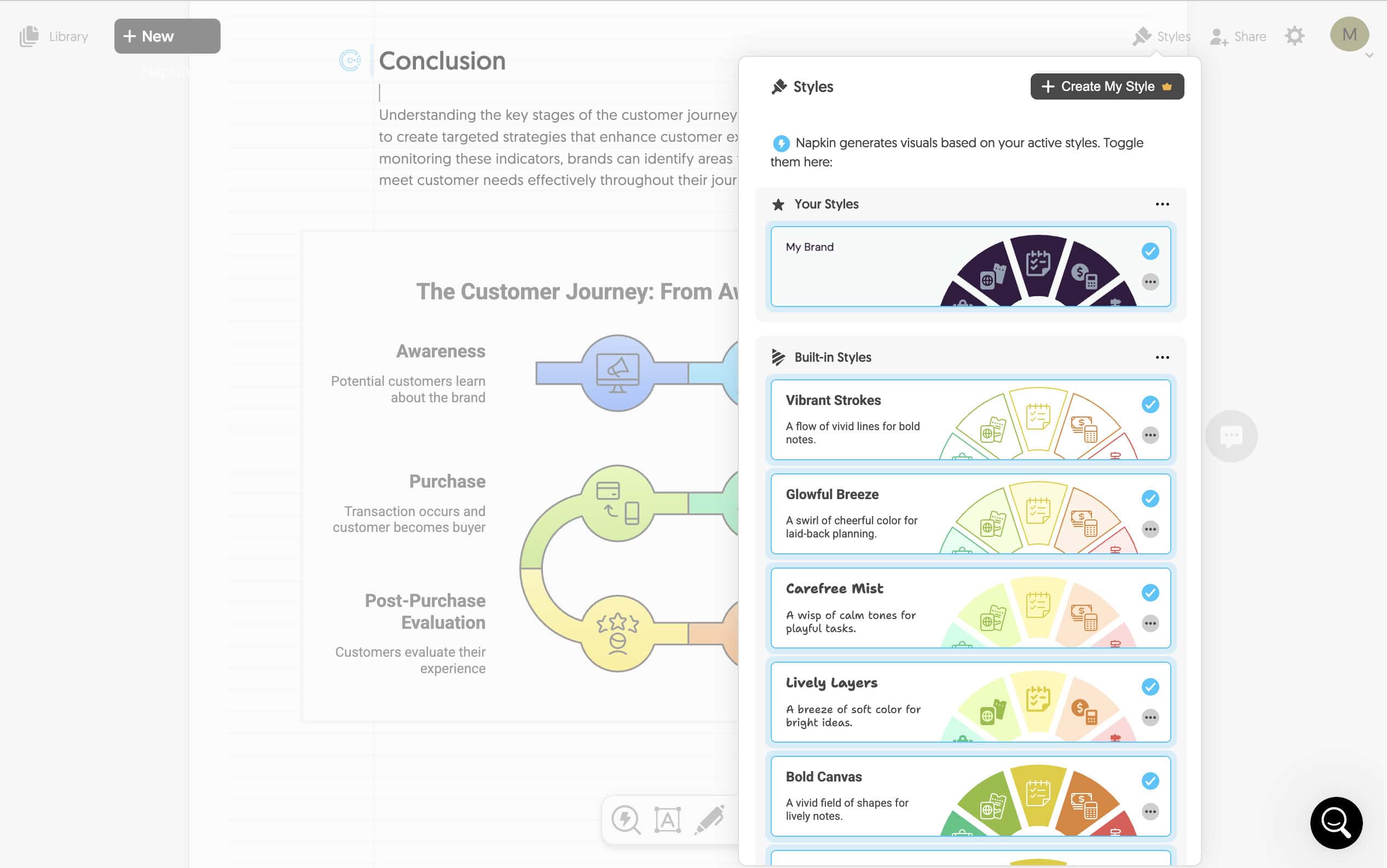
The number of brand styles you can have depends on your subscription plan.
“Plus” offers 3 and “Pro” is unlimited.
7. To apply to your visual, select the graphic, click “Change styles” and select your new style.
You can edit styles anytime you want!
8. The last thing I want to change is some of the text.
Simply click any text element and edit the content.
The text editing is excellent. It’s fluent, robust and fast to make any changes.
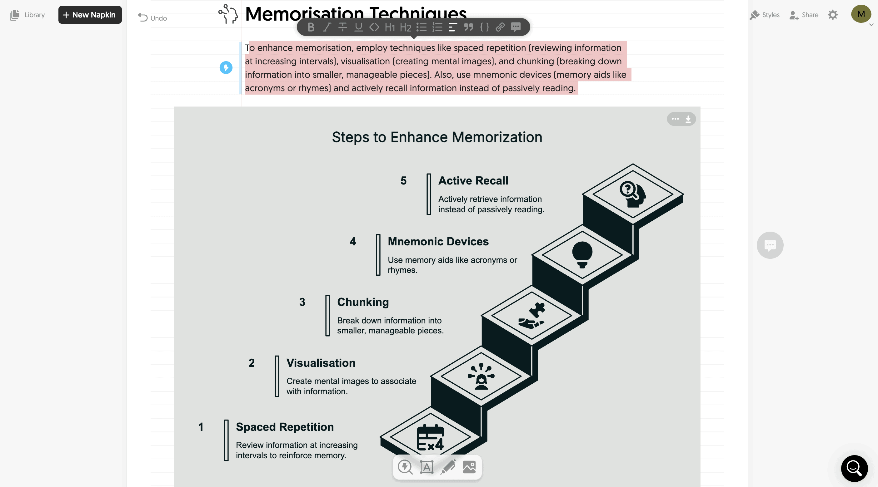
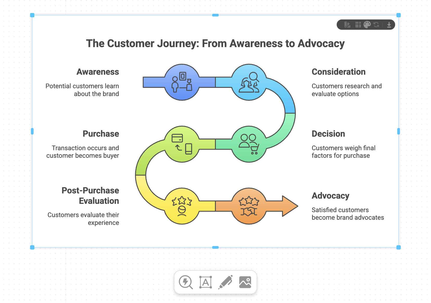
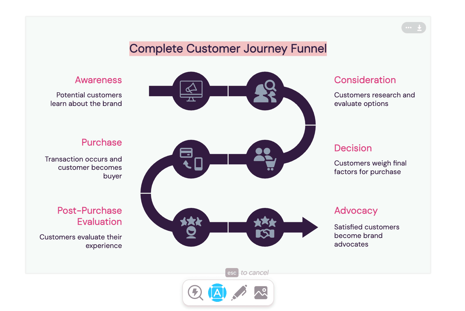
9. There is one more feature I want to show you: Connectors.
These are the lines or arrows that connect elements together. The AI is smart enough to work out which elements belong together.
But the cool thing is you can change or edit these connectors as needed.
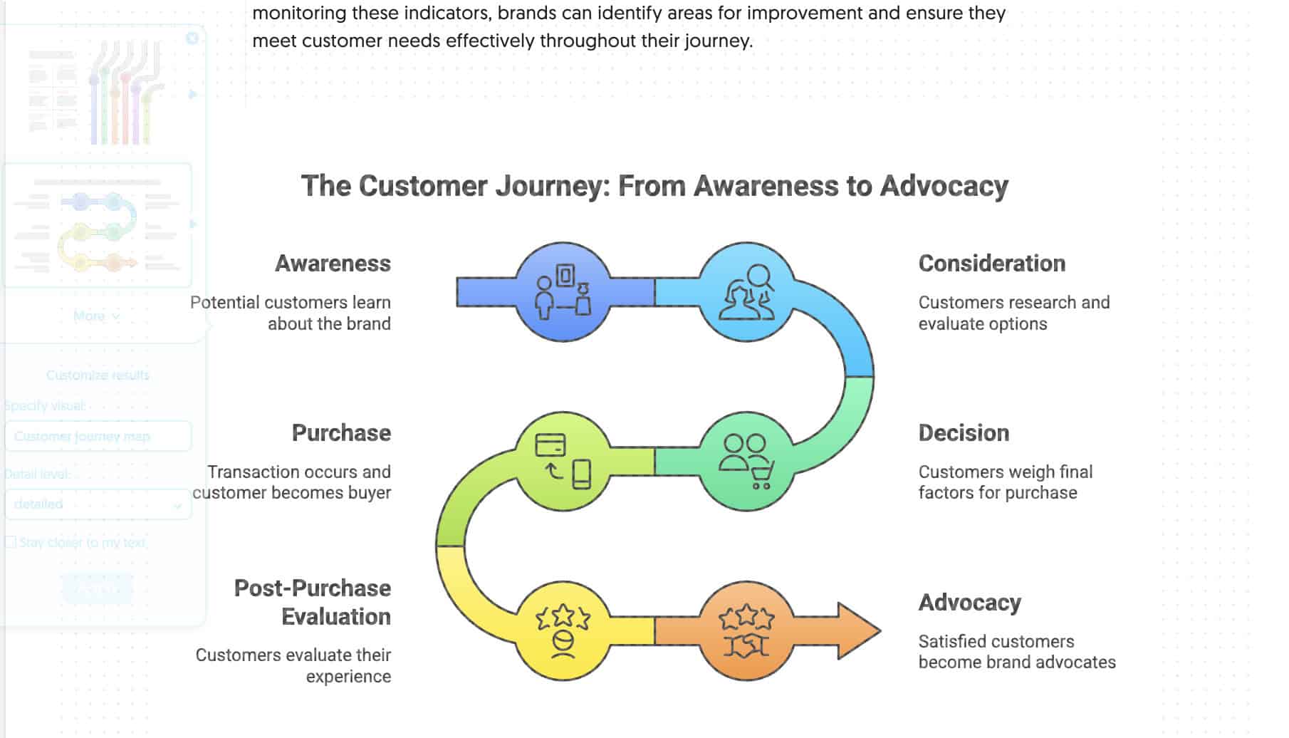
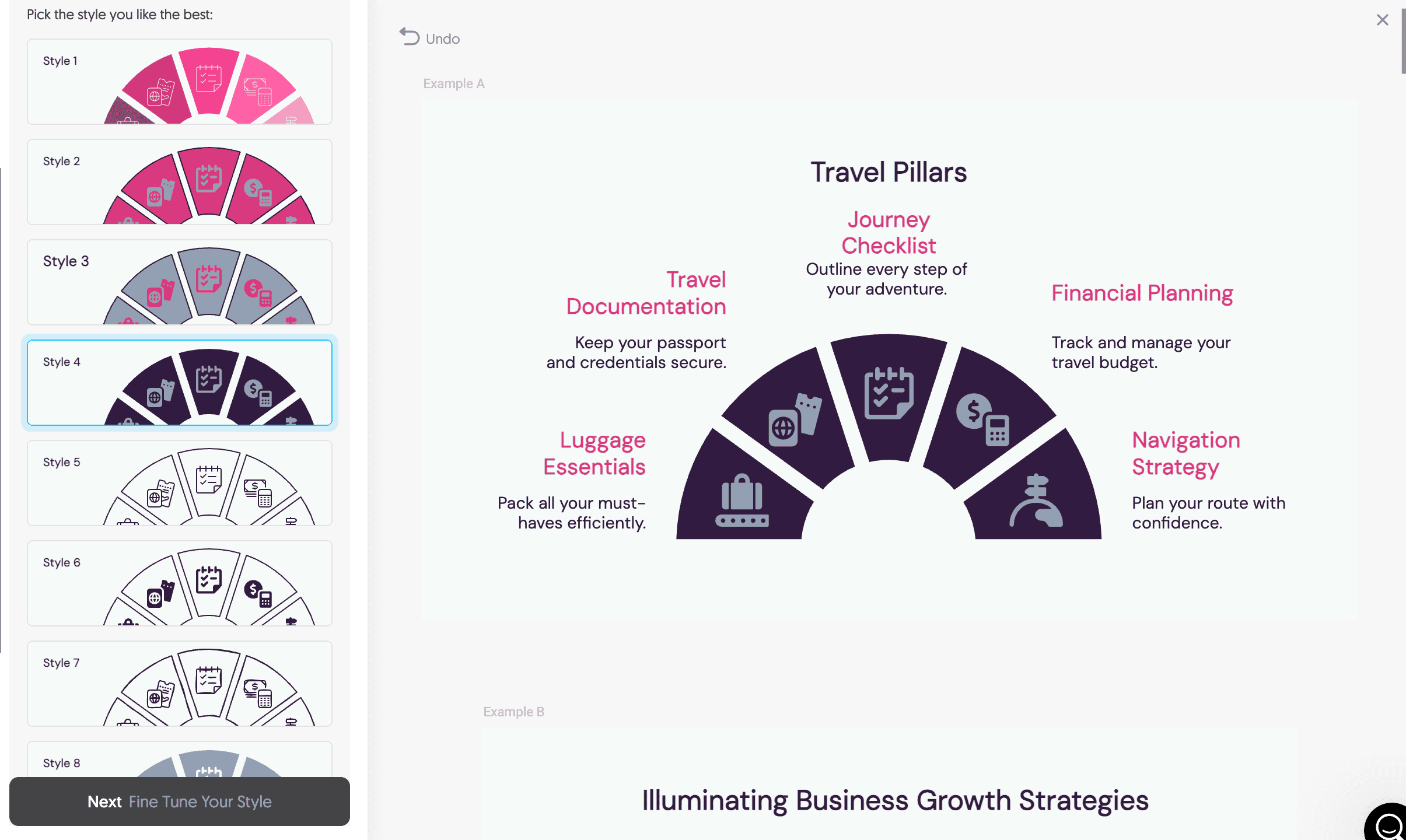
For example, my customer journey map graphic currently has 6 stages. What if I want to add a 7th?
Click on one of the connectors and choose the plus icon.
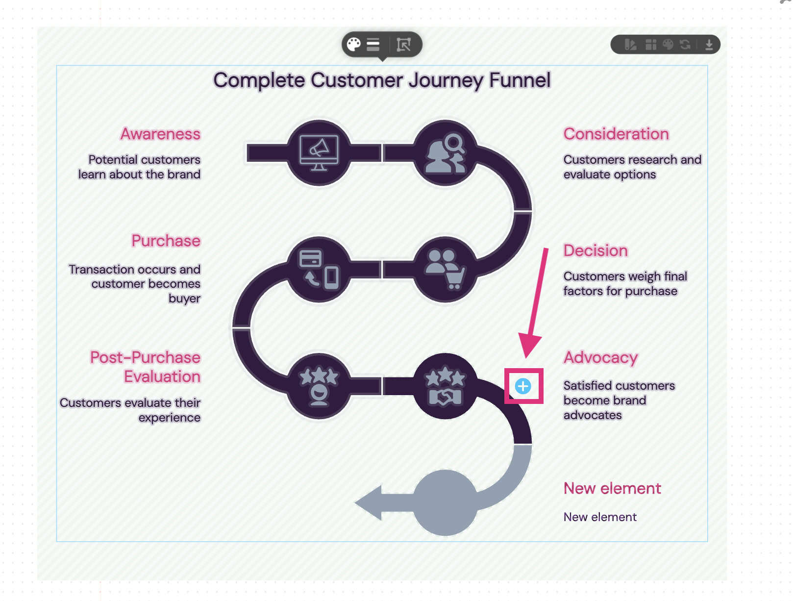
You can see that Napkin AI intelligently adds another connector, allowing me to add a 7th stage to my graphic.
Cool, right?
I love this feature because it is so fluent to use.
Compare this to a tool like Canva, where you would have to:
- Find the element
- Add it to the design
- Align it properly
- Resize it
- Change the colour
With Napkin AI, it’s just one click!
To generate this graphic, it took less than 3 minutes from start to finish. ⏰
That’s fast!
Export & Sharing Options
One of the great features Napkin AI offers is the ability to collaborate with others and export visuals easily.
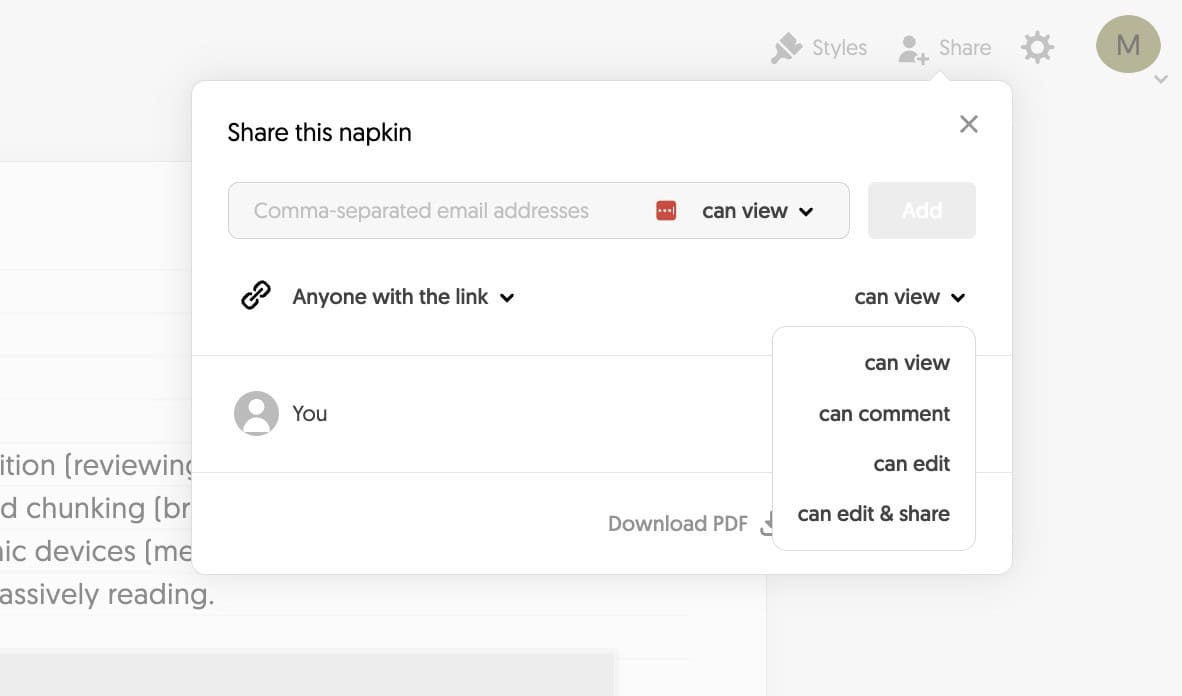
Click “Share”, and you are given four sharing options:
- Can view
- Can comment
- Can edit
- Can edit & share
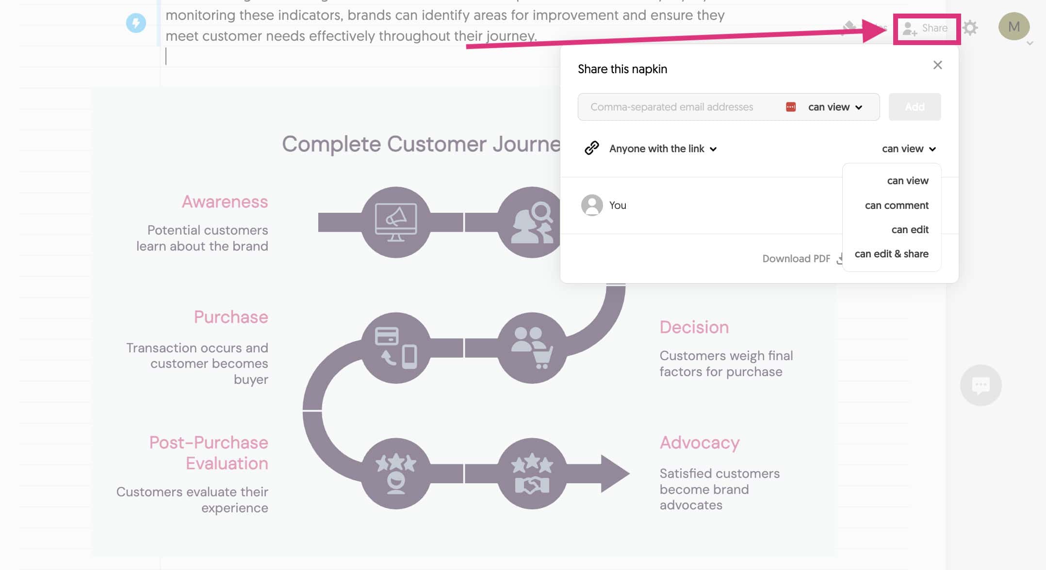
Then, add the person’s email or copy a link and share with them directly.
It works very similarly to sharing a Google doc and the user experience is excellent.
Once the user receives the link, they can easily make comments on any element on the page.
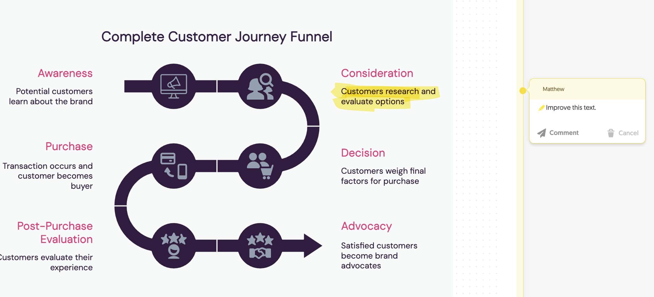
To make a comment, you use the yellow marker tool to highlight the element or text and then just write the comment on the left.
This level of precision in tagging individual elements makes it easy to receive feedback and make changes without ambiguity.
Need to export your Napkin?
Click “Export” in the top left of the graphic and choose the file type:
- PNG
- SVG
- PPT
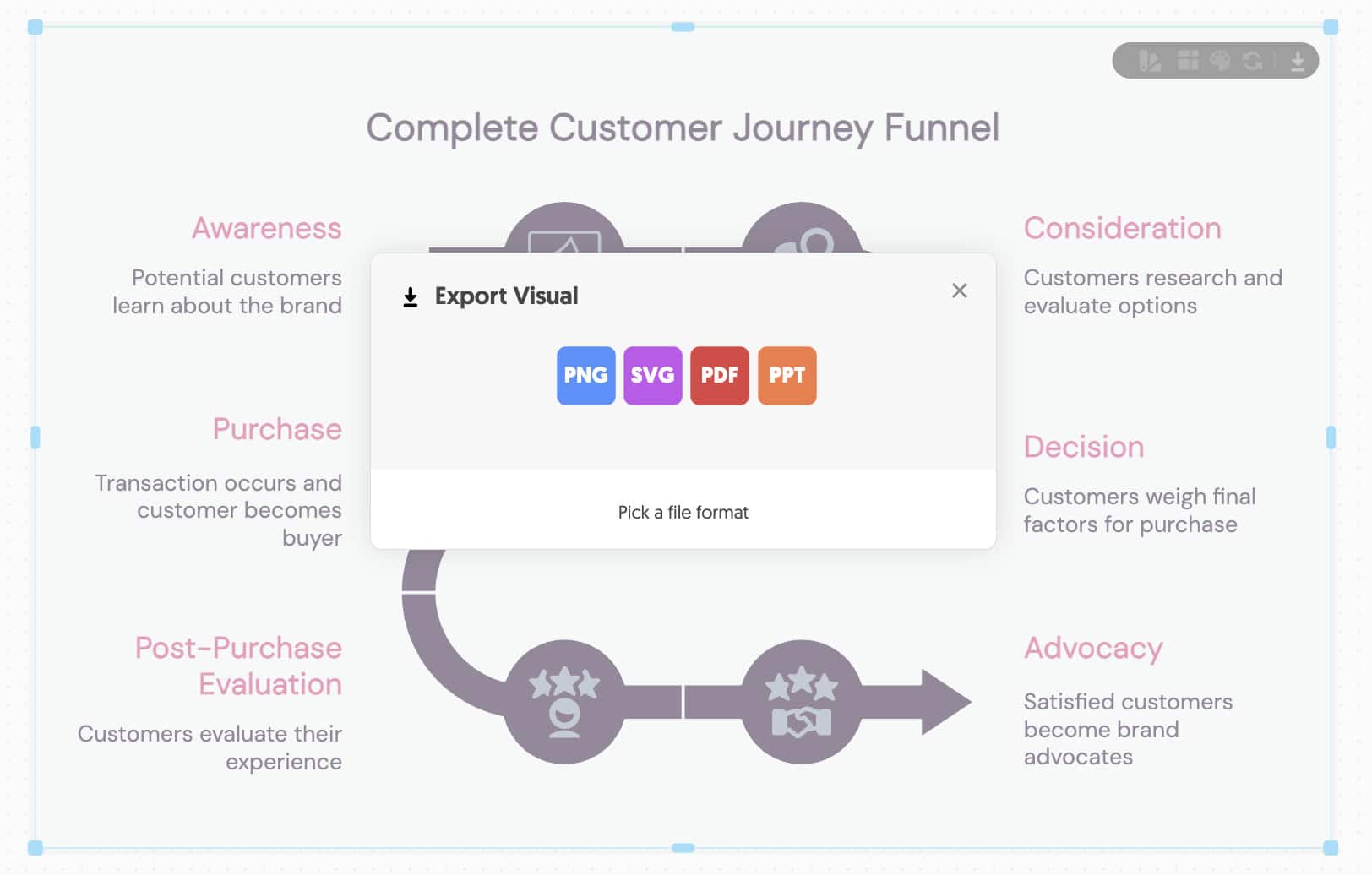
The download will happen instantly!
The speed of sharing a visual is excellent in Napkin AI. The sharing features are fast and straightforward.
That’s exactly what you want when collaborating!
Integration With Other Tools
Integrations are limited with Napkin AI.
Currently, no native integrations or API access are available.
There is definitely some room to integrate business tools like:
…and even other design tools like Figma.
I can even see room for custom AI-powered processes using AI agents!
I don’t think it’s a major issue for most users, and the developers will likely add integrations later.
But if you want to integrate Napkin AI into your workflow, you will need to create custom processes.
Performance Evaluation
The biggest question most people want to know is…
Are the generated visuals usable?
Here’s what you need to know:
Visual Quality Assessment
I’ve created dozens of images, and my team has even started adding them to the content on SearchLogistics.
So, how is the quality?
Short answer – It exceeded my expectations.
The visual aesthetics are clean and modern. The AI handles all of the spacing, alignment and visual hierarchy perfectly.
What’s clear is that the AI does a great job at understanding the text and knowing how that translates visually.
Honestly, we’ve used graphic design services that produce worse results than Napkin AI and charge way more.
I also like the level of customisation.
While it’s not a drag-and-drop experience that tools like Canva offer, it will allow you to produce visuals significantly faster.
That AI does all of the heavy lifting for you!
In terms of sophistication, the visuals tend to be on the more basic side. You are limited to the templates that Napikin AI has built into the platform.
Don’t expect to generate detailed infographics (yet)!
But for most business owners, the visual quality will be more than enough.
And the speed at which you can create means that Napkin AI will likely become your number #1 design tool!
Accuracy & Relevance
Napkin AI’s ability to interpret text and turn that into a sophisticated graphic is mind-blowing!
I’ve test a range of different use cases, text options and prompts. The output is almost always what I had in mind – sometimes better!
What’s most impressive is the relationship mapping…
For more complicated topics like project management workflows, the AI understands the sequence and how different concepts relate to each other.
From there, it establishes a hierarchy and creates the visual.
And that’s just the beginning…
Napkin AI has contextual awareness built in.
What does that mean?
It picks appropriate icons or visual elements that accurately display the text, resulting in a highly relevant representation of what you are communicating.
There were times when the designs felt a bit basic.
The key is the text you give it as context.
The more detailed your text is, the better the output.
The AI won’t read between the lines. If you give generic text, you’ll get more generic results.
That means there is a small learning curve to learn how to prompt accurately.
Overall, I can’t fault the AI for accuracy and relevance.
It was better than I expected, and it clearly understood the text provided before translating that into eye-catching designs.
Speed & Efficiency
This is the biggest benefit that Napkin AI offers…
It’s fast!
I timed myself to see how long it would take to make a graphic from start to finish.
On average, it took less than 3 minutes to make something like this:
I already have my brand colours built, but that is super fast!
The reason it’s so quick is Napkin AI’s workflow. The tool takes you through an efficient process that makes it easy to generate quality visuals quickly.
You don’t need to think – just follow the process and let AI do the heavy lifting.
Compared to using other tools like Canva or PowerPoint, it cut my creation time down by about 80% (3 minutes instead of 13 minutes).
That’s a massive difference! And you don’t need to think as much because the AI does the design work.
Use Cases
Now you understand the types of visuals you can generate, I will show you how they can be applied to different use cases.
Everything from content creation, social media and even full business presentations can be generated in minutes, not hours.
Content Creation
The biggest use case for Napkin AI is content creation.
Creating visuals for social media or blog posts takes time. The cool thing here is that you can write the content and then simply copy and paste it into Napkin AI.
The AI generator will create a graphic in seconds.
Blog Posts Visualisations
This was a big one for me.
I paid a lot of money to have graphic designers create graphics for all of my content. And it took a lot of back and forth to often get what I wanted.
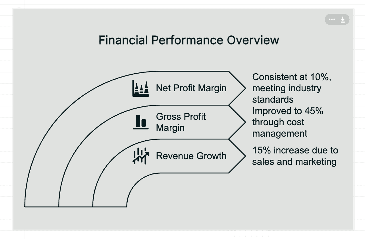
Here’s the result I got from pasting text from my blog about what makes a quality backlink:
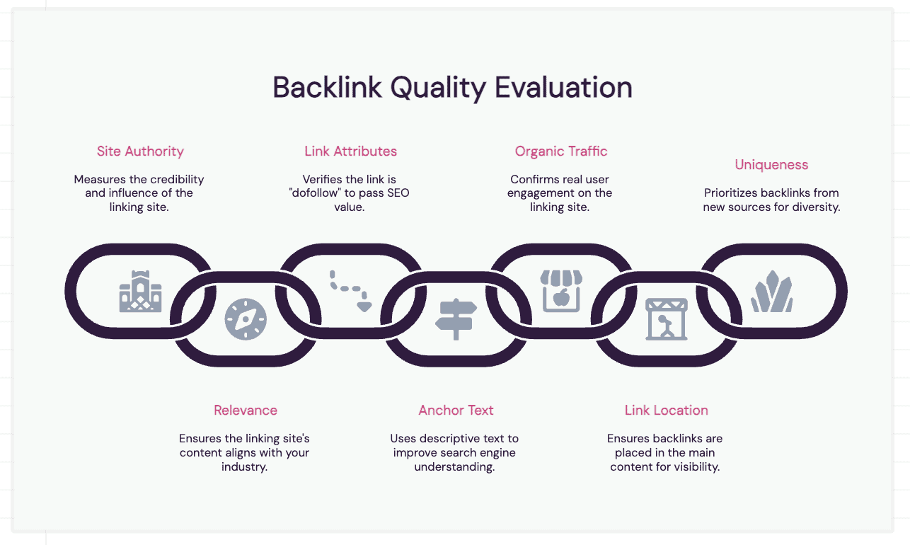
Cool, right?
All I did was copy and paste the text and click generate.
No editing, Napkin AI did it all.
Social Media Image
Following on from my backlink graphic for my blog, I wanted to create a social media image that would get people’s attention and advertise my blog post.
So, I gave a few concise bullet points and got this result:
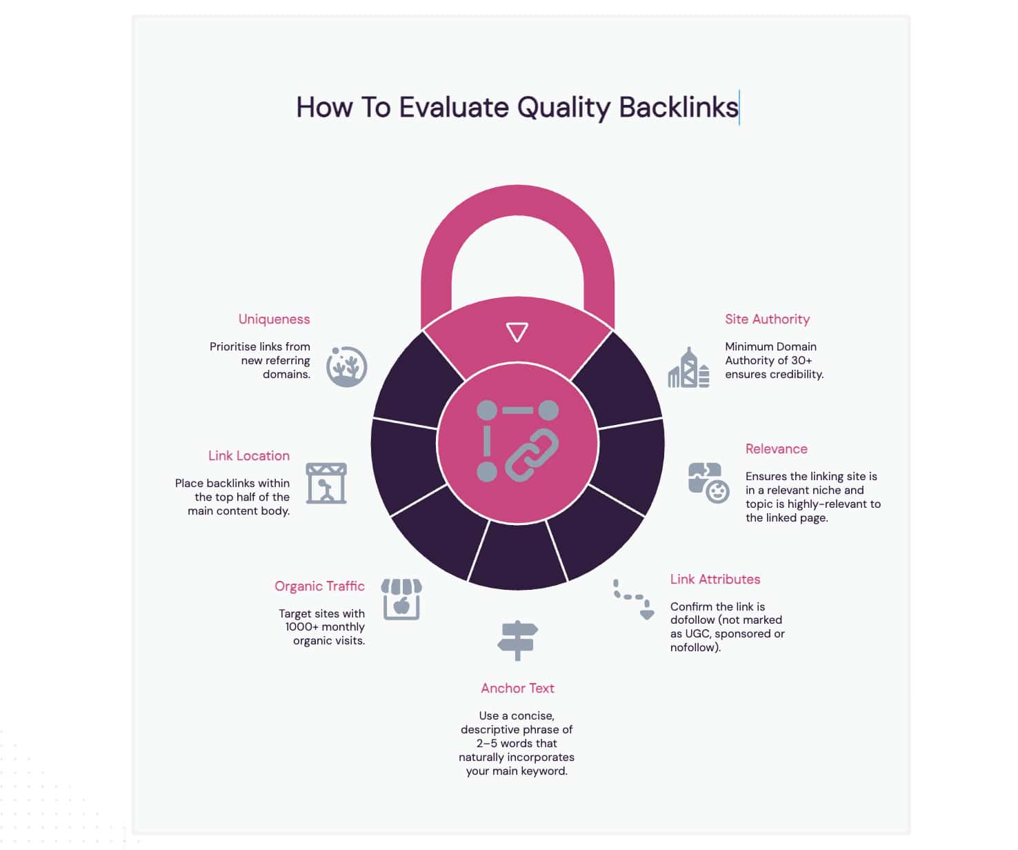
This took a little fine-tuning. The AI struggled to understand the importance of using numbers in the text, but it was quick to make the adjustments in the end.
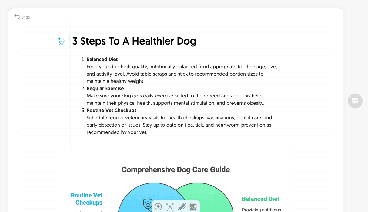
Step-By-Step Guides
For this, I took the first strategy from edu backlinks post and pasted it into the Napkin AI editor.
The goal was to get a step-by-step guide for the strategy:
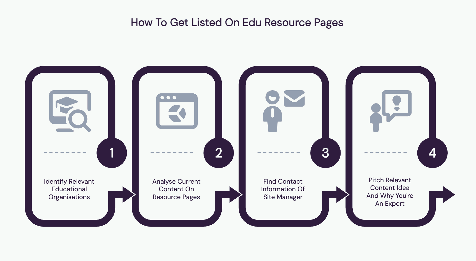
Although on the basic side, it understands the text and breaks it down into four key steps. It’s great to include in the content itself or share on social media.
Business Presentations
Need to create a business presentation for your work?
Napkin AI can help you generate individual slides in minutes.
Add all of your text to a new Napkin.
Then, highlight each individual text paragraph and start generating the text.
Just work your way down the Napkin document and keep generating each section.
The great thing is that you can keep everything in one document, so it’s easy to make adjustments as needed.
Education
Napkin AI makes putting lessons together a breeze if you are a teacher or university lecturer.
Even if you’re creating an online course, you can let Napkin do all the design work while you focus on the educational content.
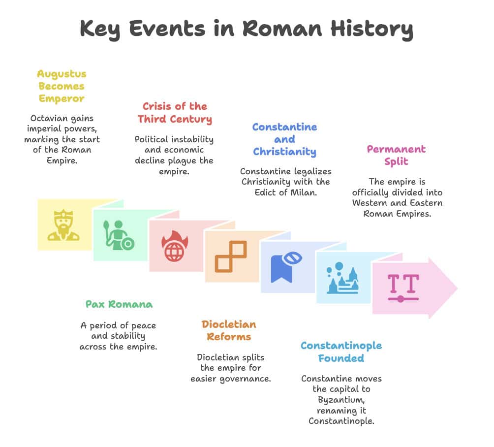
Here are a few ways you can use Napkin AI for education:
- Create visuals for lesson plans
- Develop concepts for complex topics
- Visualise historical timelines or relationships
- Design more engaging course materials
- Help students understand abstract concepts
One of the big features for education providers is the “Customise Results” editor.
This gives you more control over how the information is displayed to your students.
For example, you could specify “mind map” so the AI knows the best way to present the information in a mind map.
The simplicity of Napkin AI means that even non-designers can use the tool to create better educational content and resources.
Project Management
Most project managers have to explain complex workflows or difficult timelines to their teams and clients.
Napkin AI is excellent at this:
- Create workflow diagrams
- Visualise project timelines and milestones
- Design team structures
- Develop visual documentation procedures
You can even take meeting notes and create visual action plans for key takeaways.
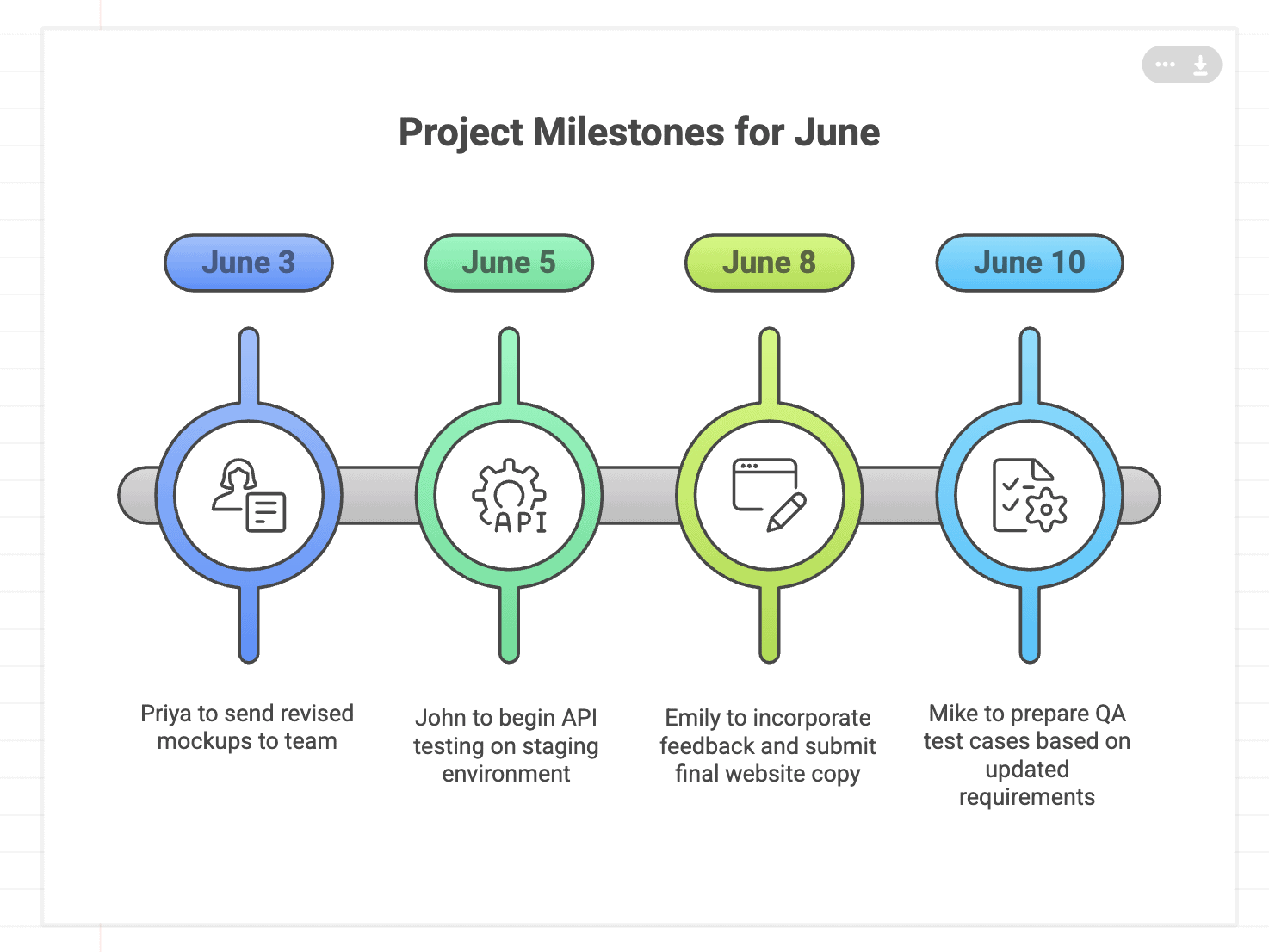
Instead of spending hours with PowerPoint or struggling with complicated project management software, you can visualise almost anything in minutes.
Marketing
Helping your clients or team understand marketing strategies isn’t easy.
Napkin AI makes this much easier:
- Create full customer journey maps
- Visualise campaign strategies
- Make stand-out presentations
- Transform data into visual insights
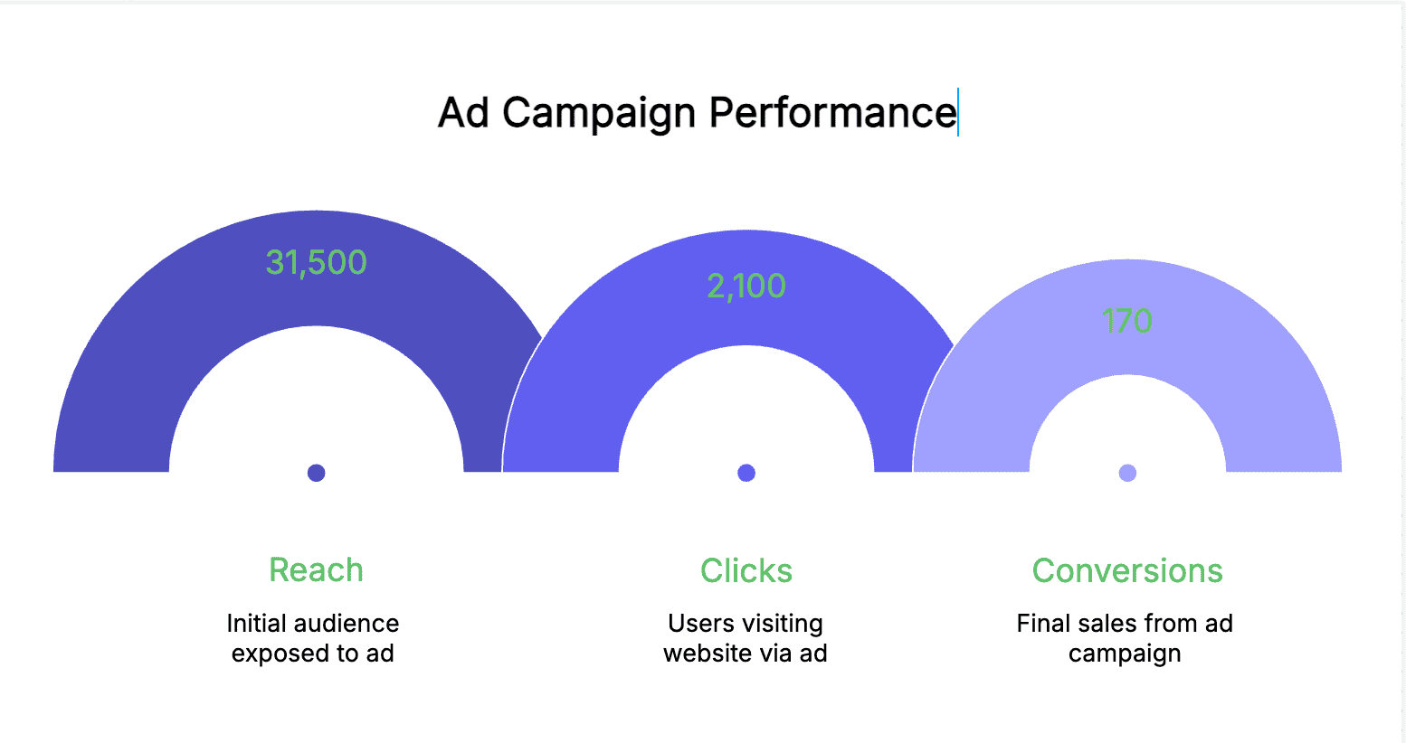
The options for marketing are endless…
Because AI is very good at understanding communication data or strategies, the quality of its results is really high.
Napkin AI Competitors & Alternatives
Napkin does have some BIG competitors.
Here’s an overview of how they stack up:
| Metric | Napkin AI | Canva | Adobe |
|---|---|---|---|
| Avg. Creation Time | 3 minutes | 13 minutes | 18 minutes |
| Learning Curve (1 = Easy, 10 = Hard) |
2/10 | 4/10 | 5/10 |
| Design Flexibility (1 = Low 10 = High) |
5/10 | 8/10 | 8/10 |
| Export Options | 4 | 7 | 4 |
| Free Plan Available | Yes | Yes | Yes |
As you can see…
There are definitely some limitations to what Napkin AI can do vs key competitors. So, to help you decide if it’s right for you, let’s dive deeper.
Napkin AI vs. Canva
Canva is Napkin AI’s biggest competitor in terms of targeting the same type of user.
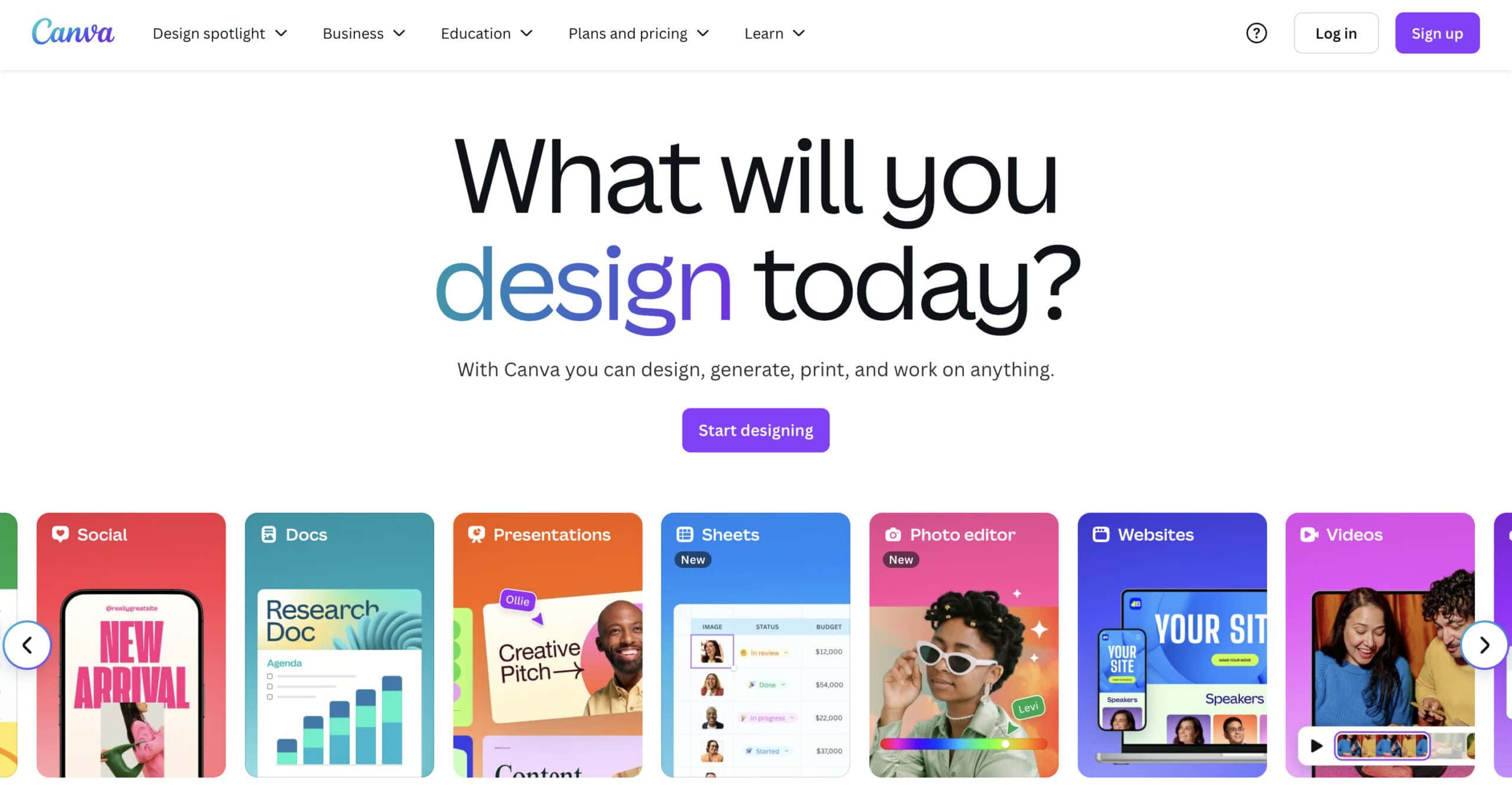
The big area where Napkin AI excels over Canva is speed.
You can generate a complete visual in less than 3 minutes.
To do the same as Canva, you’ll need a lot longer.
But Canva offers a far deeper editing platform with way more customisation.
You also get a powerful drag-and-drop interface that allows you to layer elements on top of each other.
Napkin AI uses more structured elements with fewer design controls overall.
While Canva has more features, it also has a steeper learning curve if you want to take full advantage of them.
Most people don’t even use half of the features available in Canva.
Napkin AI’s streamlined process means there is a minimal learning curve.
What about the price?
Both platforms offer a free, limited plan. Napkin AI’s paid plans start at $12 per month, and Canva’s start at $12.95 – pretty similar in terms of price.
Bottom Line:
Choose Napkin AI for quick visual creation with a simple, streamlined process. Canva is better if you want more design options and to create more sophisticated designs.
If you’ve got the budget, having both (like we do) might be the way to go!
Napkin AI vs. Adobe Express
Adobe Express takes a different approach to Napkin AI, integrating quality design tools with AI.
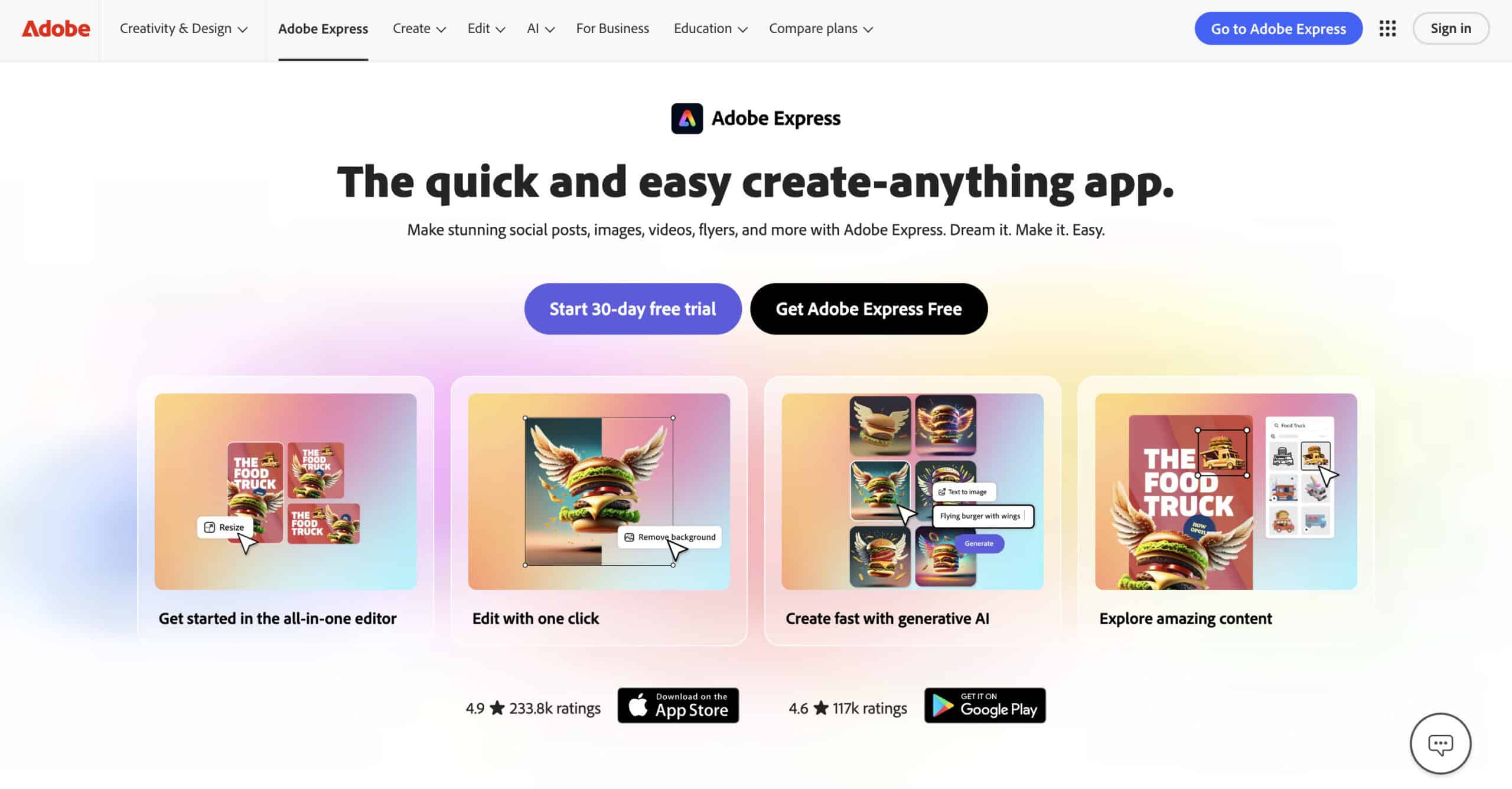
Again, Napkin AI clearly wins out with speed in generating graphics in a couple of minutes compared to 18+ minutes for Adobe Express.
But Adobe is far more sophisticated with more in-depth design tools and options.
Adobe clearly has a different target audience, focusing on designers who need to tools to create sophisticated images and graphics.
AI is another area that’s different…
Adobe’s AI has a range of capabilities, including image generation, background removal and video enhancement.
Napkin AI excels at turning text into usable, diagram-focused visuals.
But the learning curve is significantly higher with Adobe.
So, keep that in mind!
Bottom Line:
You can’t beat Napkin AI for rapid, quality visual generation. Adobe Express is more of a professional suite that is better for comprehensive marketing content and design needs.
Napkin AI Pricing
Napkin AI has a completely free plan.
It’s perfect for basic designs or just getting a feel for the platform before committing to a paid plan.
So, how much does Napkin AI’s paid plans cost?
Here’s the pricing table:
| Free Forever | Plus | Pro |
|---|---|---|
| Free | $12 per person/month | $30 per person/month |
| 500 AI Credits | 10,000 AI Credits | 30,000 AI Credits |
Besides the AI credits, the biggest difference is in design features.
You get more icons, styles and design elements with Plus and Pro. That means you can generate more sophisticated designs.
It’s also worth mentioning that Napkin AI offers a 25% discount on all plans if you opt for an annual subscription!
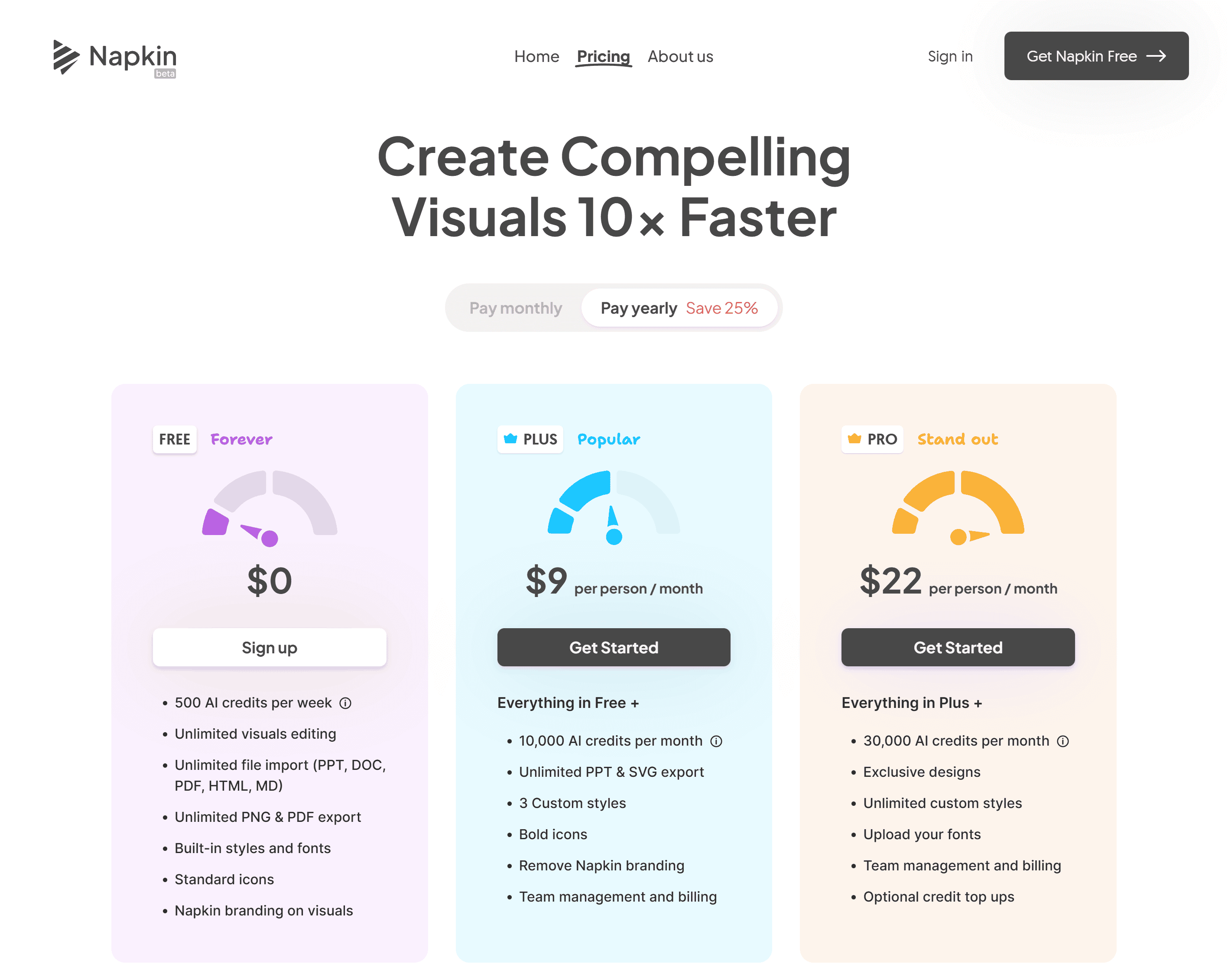
In my opinion, it’s absolutely worth it if you know you will use the tool regularly.
The credit system is a little tricky to understand.
Essentially 1 credit = 1 AI action. I found that it costs about 30-50 credits to generate a visual. But it really depends on the design, elements and words used.
In terms of value for money, Napkin AI really excels.
The fact that you have a completely free plan and the paid plans start at just $12 per month means there is no doubt that Napkin AI offers excellent value for money.

Wrapping It Up
Here are my final thoughts…
Napkin AI is an absolutely no-brainer if you do anything related to creating visuals. At the very least, everyone should use the free forever plan.
What it comes down to is the level of design you need.
If you need highly sophisticated, customised visuals, then Napkin AI will only take you so far.
But if speed is a major factor, like it is to me, Napkin AI will become your new best friend. The best part is that you don’t need any design skills to use it!
That means it’s perfect for:
- Bloggers
- Small business owners
- Content creators
- Marketers
- Project managers
…and even education providers who want to generate great visuals without spending hours on design.

Frequently Asked Questions
 Napkin AI Review
- Review Of: Napkin AI
- Reviewed By: Matthew Woodward
- Rating:


- Updated On: Jun 16, 2025
Summary:
Napkin AI transforms plain text into eye-catching visuals in seconds. No design experience needed.
View More DetailsYou Might Also Like


What Are Your Thoughts?
3 Responses

I really like this tool. I just threw in some stats from one of my blog posts and it came up with a variety of great data images. Much easier to absorb than a table. Thanks so much for sharing – never would have come across it otherwise
Napkin sounds absolutely amazing – if it really works as you describe, it really answers a huge need. I’m definitely going to try it out when I write our next article. Thank you very much Matthew!
You’re welcome, Nick!