


If you’re a full time SEO then it is likely you track a huge range of metrics on your site and you are not so bothered about how to improve CTR.
Most people tend to focus on:
- Where they rank
- The amount of traffic they are getting
- How much money they are making
SEO’s are usually very busy people managing lots of sites so it’s logical to focus on the core metrics.
But there is another much more important metric you need to focus on which could be costing hundreds/thousands in commissions every day.

What Will I Learn?
Conversion Rate Explained
The conversion rate is the percentage of people that visit your site compared the amount of people that complete a specific goal which you can track with Google Analytics event tracking for example.
A Goal can be anything from a newsletter signup to clicking your affiliate link.

For example if 100 people a day visit your page and only 1 of them finds and clicks your affiliate link you have a 1% click through conversion rate.
There is a case study at the end of this article that shows you how to improve CTR & how I increased revenue of a site by 20% just by changing the colour of a button.

Why Is This Important?
Well let’s assume you have a 1% click through conversion rate which earns £10 per day. 99% of the traffic goes to waste which leaves an awful lot of money on the table.
If you increase it to just 2% you could double the amount of money you earn…
With the same amount of traffic.Let’s face it, getting a website ranked in Google is hard work so once you have a steady flow of traffic you need to maximize the earnings per visitor as much as possible.
And the best way to do that is to learn how to improve CTR on your site.
Conversion Rate Optimisation (CRO)
This will vary depending how you push people through your affiliate link. Some people just use straight text links while others will use price comparison tables, buttons or banner advertising.
We can setup tests to measure how effective your affiliate link placement is and then test it against other variations to see which gets the better response from your traffic.
It sounds complicated but here is how it works, let’s assume you have a blue buy now button-
- Create a red version of the button
- Show half of your traffic the red button and the other half the blue button
- Measure which one gets the highest click through rate
- Take the winning button and setup another test to improve conversion further
You can literally test anything from link placement to the link text color. Even testing the headline of the page can reduce bounce rate and improve click-through rate.
So now you know how to improve CTR – make sure you test everything!
I would recommend you start by optimising your affiliate links though.

How To Improve CTR Case Study
The best way for me to illustrate this is with one of my own conversion rate optimisation tests.
I have a website and the sole purpose is to get the user to click on a banner with my affiliate link.
The original banner had a 41.5% click-through rate and looked like this (I removed the text)-

I then create 4 variations of the banner which looked like this-


I setup a split test for all of the banners which would rotate them evenly to my visitors. With 5 banners in the test they were each shown 20% of the time.
I use Google Website Optimizer for most of my conversion rate experiments which is free and easy to use.
I let the test run for a week to collect enough data to make a decision on. You might need to run your own tests for longer depending on traffic volume.

The Results
The results are actually quite interesting-
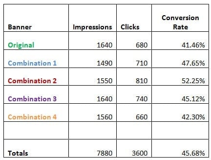
As you can see the original banner had a 41.46% click-through rate and was actually the worst performing banner out of all of them.
The best performing banner was the Combination 2 which had a massive 52.25% click-through rate. That is a massive improvement to the overall click through rate of the page.
In total I ran 7880 visitors through this test, if they were all shown the original banner I would have gotten 3,267 clicks to my affiliate link.
If I had shown them all Combination 2 then I would have gotten 4,117 clicks to my affiliate link.
That’s an extra 850 clicks to earn potential commission from with the same amount of traffic. Just from changing the colour of a button!
So this simple test achieved-
- An Improved click through rate to 52.25% from 41.46%
- That is a 20% improvement over the original
- An extra 850 affiliate link clicks

Summary
I hope you can see why you should be paying more attention to how many people actually click on your affiliate link once on your site.
We work hard to get traffic to our pages but many of us don’t pay the same care and attention to converting that traffic into cold hard cash.
So now you know how to improve click-through rate on your website.
What are you waiting for?How much money is your site leaving on the table every single day?

You Might Also Like


What Are Your Thoughts?
53 Responses


Thank you so much, it is really very helpful
Thank you so much, it is really very helpful for me… 🙂
Glad to hear that!
Great post! Thanks for share.
No problem!
Hence why I said “be careful how quickly you decide which is better”. 🙂
Thanks for this. Following your example, I have converted my website’s links and primary color from green to red. Will see how it converts.
Are you split testing it?
I don’t mean this to sound condescending, but I’ve conducted A/B split test without any change in A or B and got 100% higher conversions in B over A. Sometimes you just get higher conversions because more people chose to click during test B. It’s not always because of the change you made.Just saying be careful how quickly you decide which is a better result before making B your new control.
Thats why you need to test with a large sample size
Hey Matthew, Nice article I had learnt about these colors in my marketing course HOW to Attract reptilian brain…
Yes, different colours for different moods 🙂
Hello Matthew first congratulations for the work you have been doing over the years. I ended up becoming a fan of yours.I saw recently that you have started to use Thrive Content Builder, I wonder if it’s easy to split the tests with it.Thank you
Hey,Thanks very much :)I’m not sure if TCB has split testing built in or not, the Thrive Leads product certainly does and it’s awesome!
Matthew your sign up buttons are green, what made you select that color in light of this article?
The green contrasts well against the rest of the design
Learned something new again.Thanks Matthew,
No problem 🙂
Incredible! Thanks for sharing.
No problem!
very interesting… colours can make so much difference…. i thought red creates anger in people but maybe it also provides a sense of urgency… ı’ve started my website with blue, lots of whit and black text… i dıdn’t want ppl to get angry when they see my website but perhaps this theory is not true…
Haha in that case I would use red for any calls to action/links/buttons
looking forward to the results! should be interesting…..
Good luck =D
Hi Matthew,I always say to clienst: The best marketer? The market decides what works. So the best marketer truely should be the best tester.Why don’t you add a video tutorial to this post how to setup Google A/B/C?Just a thought :)Emielps. You have inspired me to pick up affiliate marketing again (I stopped in 2010 and switched to local clients). Thanks.
There are lots of split testing posts across the blog
Well the general rule of colour is any call to action should be in contrast to the main theme.
Hey Matt, I guess the playing with conversion rates is a never-ending game. Audience will change their preferences throughout the time. Today they like red, tomorrow they prefer orange.I’ve seen several conversion rate experiments with colours and they are all different and individual. What works on your website will not necessary work on mine,The strategic conclusion that I made about conversion experiments is to find what works well, then stick with it for a while, and then experiment again.
Good case study you got here. I always think that green is the best color for button.
There is no ‘best’ colour – it depends on the site. A green coloured site with a green button won’t convert very well etc
No no sarcasm – the truth. Make things ugly and people click them!
Sorry, my english in not good enough. I’m not sure if your are being sarcastic because you didn’t like my comment. If that’s the case, I intended no offense.
Yup – make it ugly as hell and stick out like a sore thumb
Excellent tips, I am trying to increase my conversions and this is definitely a help. As an affiliate marketer with limited traffic it is important that I increase the conversion rates.
Glad it helped out 🙂
Great article, I agree with what you have said and have also found similar results with my own tests. I tested Luminous colours with contrasting text and discovered Yellow with red text converted highest.Would you mind if I re-post this article on my blog?I think my readers would really appreciate it.Onur
Hi Onur,Its strange what works sometimes :PYes feel free to republish, drop me an email and I’ll send it you with all the formatting/html markup
Well; red and yellow. The only problem is that yellow is usually too light for buttons. I like using orange-ish colors (closer to read than yellow) so that it doesn’t look like a “warning color” and that had been fairly good for conversions
I ran an Indonesian mlm site which incorporate the ‘red-buy-now’ button. Statistically agree with you = )
Hahaha what colour was the rest of the site?
No worrys 🙂
First of all thanks Matt for awesome posts.I really appreacite if you will share link color experiment with us.Thanks,Umee
results will be published within a couple weeks!
looking forward to the results! should be interesting…..
Another awesome post Matthew I have been trying different ad placements and background colors, I will try changing affilliate link colors and see how that works out. I have been trying things from your other tutorials and they have been giving me good results. I look forward to your next post 🙂
Cheers Gene – I’m going to setup a split test changing all the link colours from pink to the ‘classic’ blue soon as well
Recently, I have started paying more attention to the conversion. So far, my only goal was to get traffic. Now, I am trying to maximize the conversion rate on that traffic. Everyday I’m trying new changes to improve the conversion rate 🙂 I’m looking into tutorials to see if you have mentioned anything about how to track/monitor your visitor activities in more detail.
Hi Nick,If your using Google Analytics you can integrate event tracking to measure when people sign up, click an affiliate link etc
This definitely works with banners/button, however have you tried this experiment with anchor text? Conventional wisdom says that native blue gets the highest CT % because people recognize it as a link.
No I haven't done but would love to see the results if you have
Good Case Study. Red color always get more attension than other colors. It's the WARNING color..lol.
As a rule red is usually the best attention grabber but not all the time 🙂
Well, if you put a red banner in a red enviroment (all links and elements in the website being red) it won’t work. In my experience it’s usually a matter of choosing a colour that is very different from the rest. Taht will focus the vistors attention on that element.