


 Subscribe to my YouTube
 Join My Facebook Group
 Connect on Linkedin
 Free SEO Tutorials
 SEO Case Studies
 Links That Rank


What Will I Learn?
What Is Mobile-First Indexing?
Mobile-first indexing means that Google ranks websites based on the mobile version of the site instead of the desktop version.
Put simply – Google uses the content on your mobile website to rank the pages.
Google first announced Mobile-First Indexing in November 2016, but the full rollout was not completed until October 2023.
This was to give website owners enough time to optimise the mobile versions of their site and prepare for the change.
What happens if you don’t have a mobile version?
Short answer: your site won’t rank well.
Let me explain:
Googlebot now acts as a smartphone when it crawls your website. That means if your website isn’t accessible by phone, it won’t be crawled and indexed.
If you don’t have a mobile version, Googlebot will load the desktop version.
We all know that desktop versions won’t look good and be user-friendly on a mobile device.
That means not having an optimised mobile version of your site will significantly impact your rankings.

Best Practices For Mobile-First Indexing
Implement these 6 best practices to make your website ready for mobile-first indexing:
1. Make Your Website Mobile Friendly
A mobile-friendly website isn’t just a nice-to-have – it’s a must. If your website isn’t mobile-friendly, this is the first thing you need to take care of.
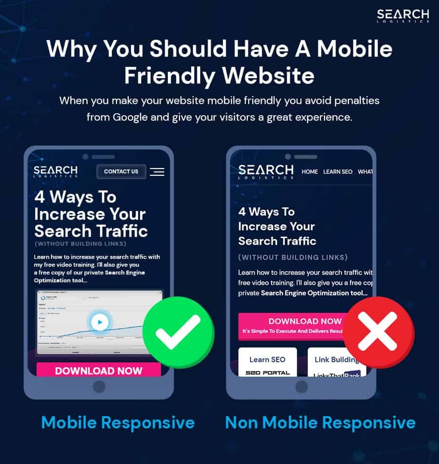
Get a responsive theme for your website that looks good on smartphones and tablets. Ensure the layout is intuitive and provides a seamless user experience.
The good news is that tons of free and paid website themes are available regardless of your website platform and builder.
These usually come with mobile-optimised versions straight out of the box.
That means there is no excuse not to have a mobile-friendly website!
2. Provide Consistent Content On All Devices
This is a mistake that I see many website owners make.
Don’t shortchange your mobile users by removing content.
The mobile version of your site should mirror the desktop version in terms of quality and quantity of content.
That means every piece of content (text, images, videos etc) should be fully accessible on mobile devices.
Don’t remove content from your mobile version because it doesn’t fit. Find a way to display it so that it looks good and consistent across all devices.
This will make your website rank better and provide a better experience for your users!
3. Optimise Mobile Website Speed
People have less patience on mobile devices.

That means your website needs to load quickly!
Optimise your site by compressing images, minimising code and enabling browser caching. This will take care of most of your speed issues.
If you need help, make sure you check out my complete increase website speed tutorial.

4. Improve Navigation And User Experience
Navigation and user experience work hand in hand.
Why?
Your goal should be to help users find the information they want as quickly as possible. That’s not always easy on mobile devices.
Here’s what you need to do:
Simplify your site’s navigation for smaller screens and ensure menus are easy to find and use. Buttons and links must be big enough to tap without taking up too much space on the screen.
Add internal links within your content to connect key pages together.
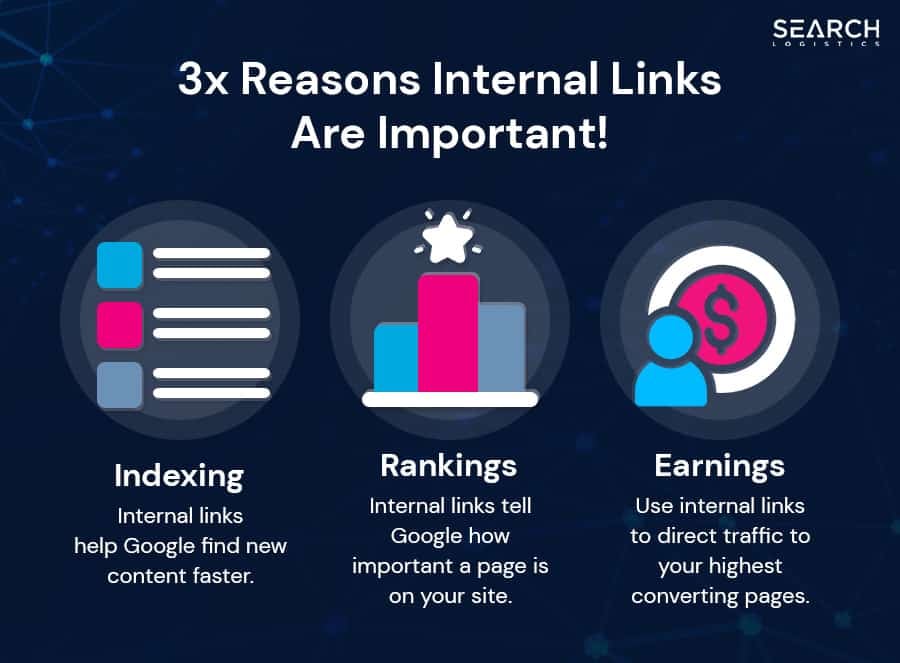
This will make browsing your website easier while helping readers find content they wouldn’t have otherwise seen.
You can use a plugin like Link Whisper to help you build internal links. To learn more about this plugin, read my full Link Whisper review.
5. Add Schema
Schema helps search engines better understand your content.
It also helps you take up more space in the Google search results, which can lead to more traffic.
Let me explain:
Implementing schema highlights key information like-
- Reviews
- Ratings
- Product details
- Price
- Recipes
- Even details
- Breadcrumbs
And more! This allows your website to be featured in the SERPs like this:

Cool, right?
The bottom line is that schema will boost your visibility in organic search results and lead to higher click-through rates.
Mobile device screens are smaller, so you want to maximise the visibility of your website in the SERPs.
6. Use High-Quality Images
Ensure that images on your website are crisp and clear.
People tend to skim and scan more on mobile devices than on desktops. Great images allow you to break up chunks of text and increase engagement.
Compress every image before uploading it to the site. Serve images in next-gen formats such as WebP.
This will ensure they load fast and still look good.

